I'm not familiar with Serif PhotoPlus, but the following works in the Free & Open Source GIMP, for something like this:
![[Linked Image]](https://i.imgur.com/TYhb5IO.png) https://imgur.com/a/zDUfCoc
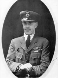
https://imgur.com/a/zDUfCoc The image I've done isn't perfect by any means, but it's a step in the right direction - you can go over the settings over and over again, fine tuning for as long as you like

As it's different software, the specific names of options might be different, and specific numbers aren't going to help, but the general gist should work.
Very roughly, newer cameras are sharper in detail, and have a higher tonal range, so you get subtlety of tone that didn't exist in older cameras.
You're looking to blur and resharpen the image, to get rid of a bit of detail, and you're looking to wash out the tonal range a bit - basically saying "everything lighter than this shade of grey is maximum white" and "everything darker than this shade of grey is maximum black" - then you're lowering the contrast between that white and black.
You could follow a similar set of steps to this:
1) Gaussian blur - just very slightly to take the sharpness out
2) Hue & Saturation - drop saturation to 0 to take the colour out
3) Levels - bring the input black and white inwards slightly, and the output black and white inwards slightly - you're aiming to lower the contrast in the middle, and have a higher amount of light tones wash out into white, and darker tones into black - but your output black/white are actually dark/light grey.
4) Curves - as with levels, you're just adjusting the specific contrast of different parts of the image. I bent the curve up a little bit near the middle.
5) Colourise - tint the grey image to a very light brown. You can refine it after.
6) Hue & Saturation - drop the saturation a bit to get a reasonable sepia.
7) Add noise - add a bit of grain to the image. Be subtle, not too much
8) Levels - again, finer tuning to bring a bit of the grain out
9) Gaussian blur - again, just very slightly
10) Sharpen - fairly subtly, it just breaks the smoothness of the blurring
11) Hue & Saturation - use the hue shift to get your preferred tone of green/brown/yellow for the sepia.
12) If you wish, go through 1-11 again to refine.
If you want a faded border on it, which tends to be a trend in portraits from the earlier half of the century, then:
13) Select an oval
14) Invert that selection
15) Feather the edge of the selection (so it fades, rather than is sharp)
16) Pick your lightest or darkest tone in the colour picker
17) Fill the selection
18) Adjust levels or brightness/contrast to bring it in line with the rest of the image.


![[Linked Image]](https://i.imgur.com/hJUtwWb.png)
![[Linked Image]](https://i.imgur.com/FmaURlF.png)

![[Linked Image]](https://i.imgur.com/JBpBFHR.png)
![[Linked Image]](https://i.imgur.com/kQkQ4rD.png)


