homepage
Colors and saturation are way off
Posted By: nuggetx
Colors and saturation are way off - 02/26/11 05:17 PM
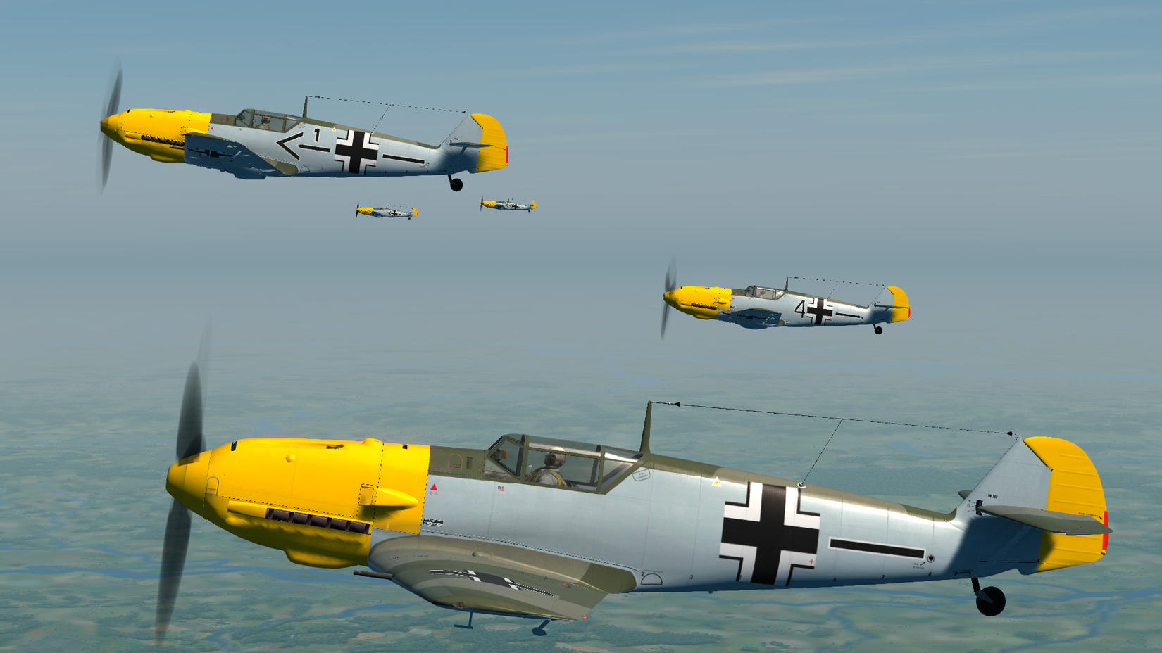
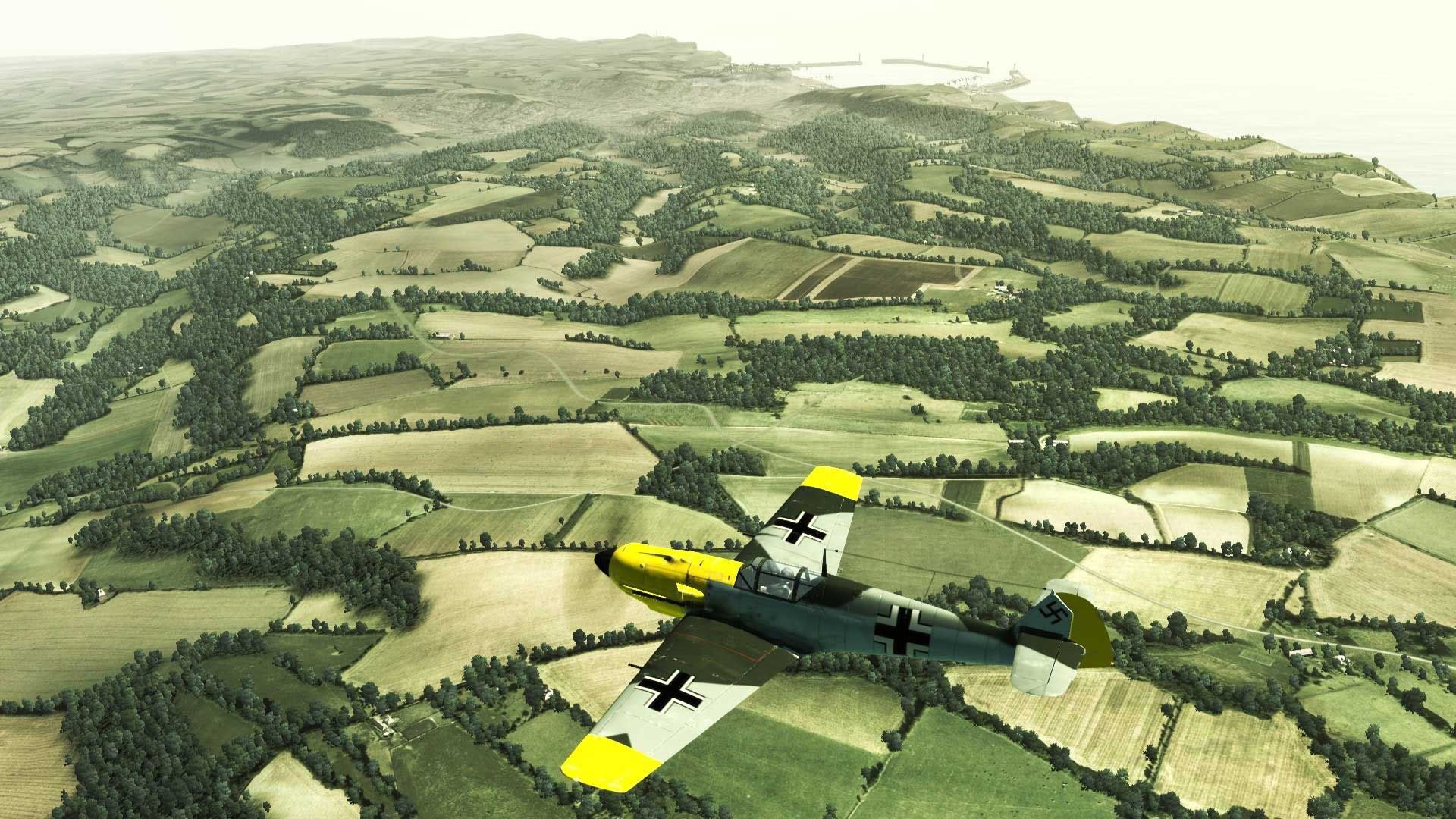
I cannot believe that color and saturation were made so the planes look like some plasteel toys.
Look at the yellow nose, the bloom , color and lightning is WAY OFF.

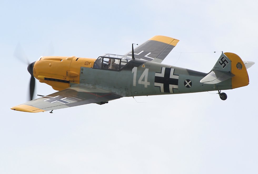
Now compare it with a real picture
http://cdn-www.airliners.net/aviation-photos/photos/2/7/5/0903572.jpg(Don't embed copyrighted images - link them instead)Oleg, seriously ?
Posted By: Sluggish Controls
Re: Colors and saturation are way off - 02/26/11 05:23 PM
ain't keeping me awake at night.
Both are lovely shots !
Cheers,
Slug
Posted By: shadylurker
Re: Colors and saturation are way off - 02/26/11 05:40 PM
Nuggetx, seriously?
Posted By: Vekiq
Re: Colors and saturation are way off - 02/26/11 05:51 PM
well, fact is that there is difference between images, but does it bother me?
Lol not at all, i am not going to loose any sleep over it, as long as it flys well
Posted By: nuggetx
Re: Colors and saturation are way off - 02/26/11 06:07 PM
well, fact is that there is difference between images, but does it bother me?
Lol not at all, i am not going to loose any sleep over it, as long as it flys well
Some of us want to have a sim as close to reality as possible, not some xbox imitation.
Posted By: TonyR
Re: Colors and saturation are way off - 02/26/11 06:17 PM
Ok, you are right so, dont buy this xbox imitation sim.
Posted By: NineLives
Re: Colors and saturation are way off - 02/26/11 06:17 PM
The guys on here will sort that out with some lovely re-skins so don't worry

Posted By: Damocles
Re: Colors and saturation are way off - 02/26/11 06:25 PM
I'm more puzzled by the type of hood on the 109.
I would have expected the cockpit hood found in the real photo to be the norm, the 109's that I recall seeing in CoD seem to have have a different, lighter framed, more rounded version.
I point it out because one of the failings of the Emil, if memory serves, was its cramped cockpit combined with poor visibility because of the "heavy" framing.
Is the cockpit hood shown above the "Galland" hood ?
Posted By: Cpt_Farrel
Re: Colors and saturation are way off - 02/26/11 06:36 PM
That canopy is an earlier version than the one seen in the picture. It's theoretically correct for the Bf109E-3 but was often replaced by the later canopy with heavier framing. The E-3 was the least numerous version used during the battle so it's kind of funny that it's the version chosen to be flyable. According to the latest research the E-1's and E-4's were far more common.
There never was a galland hood, Galland designed the head-armour with a thick armoured window for improved vision which became standard in late 1943 I think.
Posted By: FearlessFrog
Re: Colors and saturation are way off - 02/26/11 06:42 PM
Sure, could be tweaked I guess. Maybe it's being done now?
Also, would a photo with the light source coming from the same direction be a better comparison to make? (Not that I care that much, but if you're quibbling with Oleg about saturation then getting that right in your two examples seems a rudimentary first step)
Posted By: coreyhkh
Re: Colors and saturation are way off - 02/26/11 06:50 PM
If you want perfect real life likes planes then your going to have to wait 10 years. 90% of peoples problems are very trivial.
Posted By: Bounty
Re: Colors and saturation are way off - 02/26/11 07:00 PM
White balance in the "real" pic looks off to me and it lacks contrast. So saying this picture doesn't look like that picture proves nothing what so ever. Unless you produce a PERFECT picture of the real thing taken at the same angle and at the same time of day etc that was in the sim it's all best guess rather than right or wrong.
I'll be more than happy to fly aircraft if they look like that. If it's to much for you then either wait for some new skins or adjust what you don't like via your monitor/Gfx card options
Posted By: Slingn
Re: Colors and saturation are way off - 02/26/11 08:13 PM
You all can argue about color tones all you want, and I'm certainly not going to tell you what your own country side looks like. But despite this being a sim, and having realistic goals, it's still someone's personal work. Their own personal creative, and artistic views are going to come into play. It is their work of art as it were, and as such, will always reflect the look, or style of the artists involved.
And when i look, I see IL3, and that's ok by me. More than OK, could you really ask for more than they've given in il2?
Well, I'm sure some will.
Posted By: Richardg
Re: Colors and saturation are way off - 02/26/11 08:53 PM
The screenshot looks identical to the photo. Notice the photo is presenting the shadow side of the plane. The screenshot is presenting the sunny side of the plane.
Posted By: nuggetx
Re: Colors and saturation are way off - 02/26/11 09:29 PM
I'm more puzzled by the type of hood on the 109.
I would have expected the cockpit hood found in the real photo to be the norm, the 109's that I recall seeing in CoD seem to have have a different, lighter framed, more rounded version.
I point it out because one of the failings of the Emil, if memory serves, was its cramped cockpit combined with poor visibility because of the "heavy" framing.
Is the cockpit hood shown above the "Galland" hood ?
+1 i'm dissapointed that such little attention has been put into proper modelling of planes.
also notice that the green camo in photo goes along the end of the hood to the tail, in the Oleg version it cuts off goes up and then to the end of the tail, it looks ugly, the wingtips are also not yellow.
Posted By: Kegetys
Re: Colors and saturation are way off - 02/26/11 09:31 PM
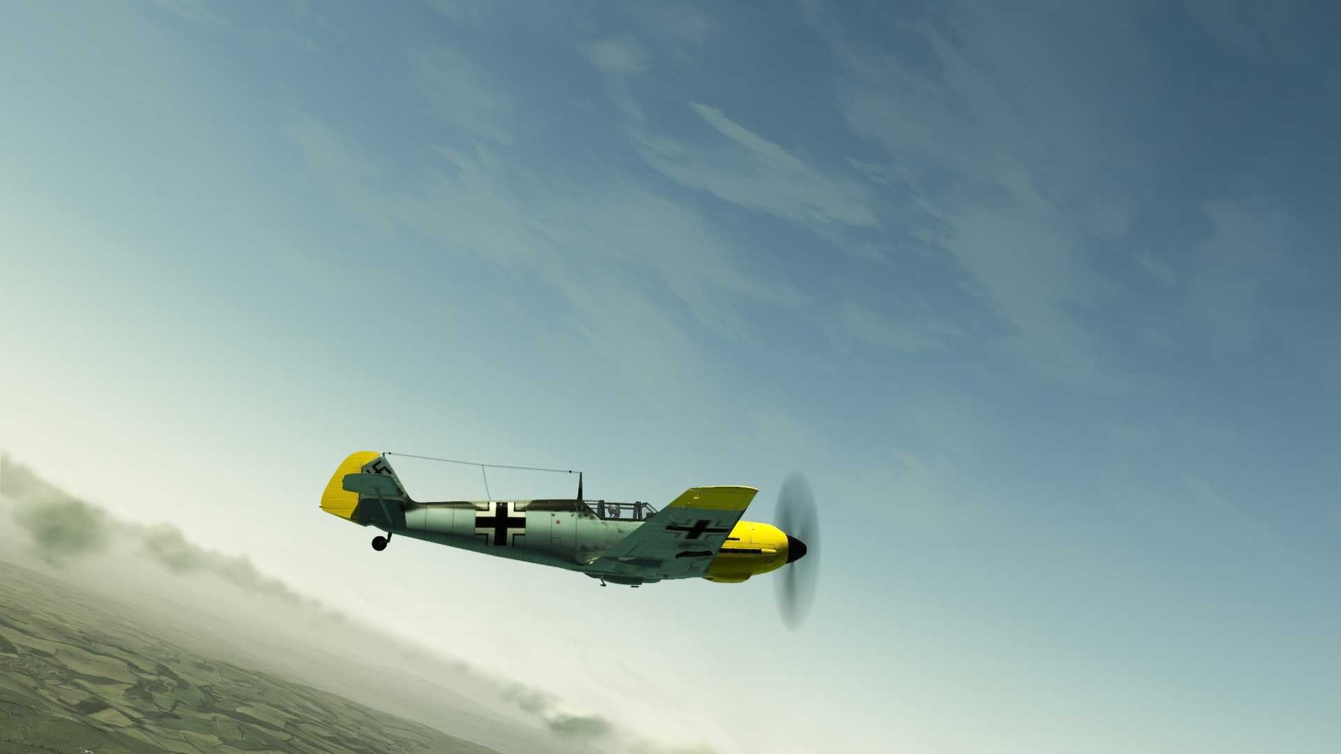
I think whats wrong is not the planes but the sky, it is way too dark resulting in the planes to look overbright and shiny. A brigher sky makes it look much better in my opinion: (quick photoshop :))

original:

Posted By: nuggetx
Re: Colors and saturation are way off - 02/26/11 09:35 PM
Here is a render of 109 e3 from WOP. Which was done with more attention to details (proper green camo, yellow wingtips, not so white color on hood [yellow is still there tho]), even the pilot looks much more natural, overall much better than Il-2.

Posted By: Foucault
Re: Colors and saturation are way off - 02/26/11 09:38 PM
Booya! Oleg, you suck!
Posted By: nuggetx
Re: Colors and saturation are way off - 02/26/11 09:42 PM
http://cdn-www.airliners.net/aviation-photos/photos/2/7/5/0903572.jpg

The WOP one looks like the one in real photo,,, cannot be done??? real planes in 10 years? nay sayers pls go away.
The Oleg moddeler team were probably under influence of SpitGirl or some other 2 week vodka party.....
(and pls don't bring stupid argument that WOP is arcade, PROPER colors and modelling can be done in any game)
Posted By: NattyIced
Re: Colors and saturation are way off - 02/26/11 09:56 PM
WoP is all show, no go.
Posted By: FearlessFrog
Re: Colors and saturation are way off - 02/26/11 10:02 PM
The one in WOP doesn't seem to have hood fasteners. Arcade-level error for the Xbox generation.

Posted By: Mogster
Re: Colors and saturation are way off - 02/26/11 10:06 PM
The CoD 109 has far greater detail, the lighting in the CoD shot is much better, more natural. The CoD 109 just needs a better, slightly weathered, skin.
I agree the WOP pilot looks better.
Posted By: dude163
Re: Colors and saturation are way off - 02/26/11 11:02 PM
I cant wait to play this and adjust the settings on my monitor if I have to

Posted By: nuggetx
Re: Colors and saturation are way off - 02/26/11 11:30 PM
I cant wait to play this and adjust the settings on my monitor if I have to

I can't wait to see you adjust the cockpit hood,pilot and model painting on 109 on your monitor.
Posted By: Anonymous
Re: Colors and saturation are way off - 02/26/11 11:34 PM
I cant wait to play this and adjust the settings on my monitor if I have to

Heretic, everybody knows that all monitors are calibrated at the factory to display the exact same colours regardless of make, model or local light conditions.
Posted By: FozzyBear
Re: Colors and saturation are way off - 02/27/11 12:29 AM
I cannot believe that color and saturation were made so the planes look like some plasteel toys.
Look at the yellow nose, the bloom , color and lightning is WAY OFF.
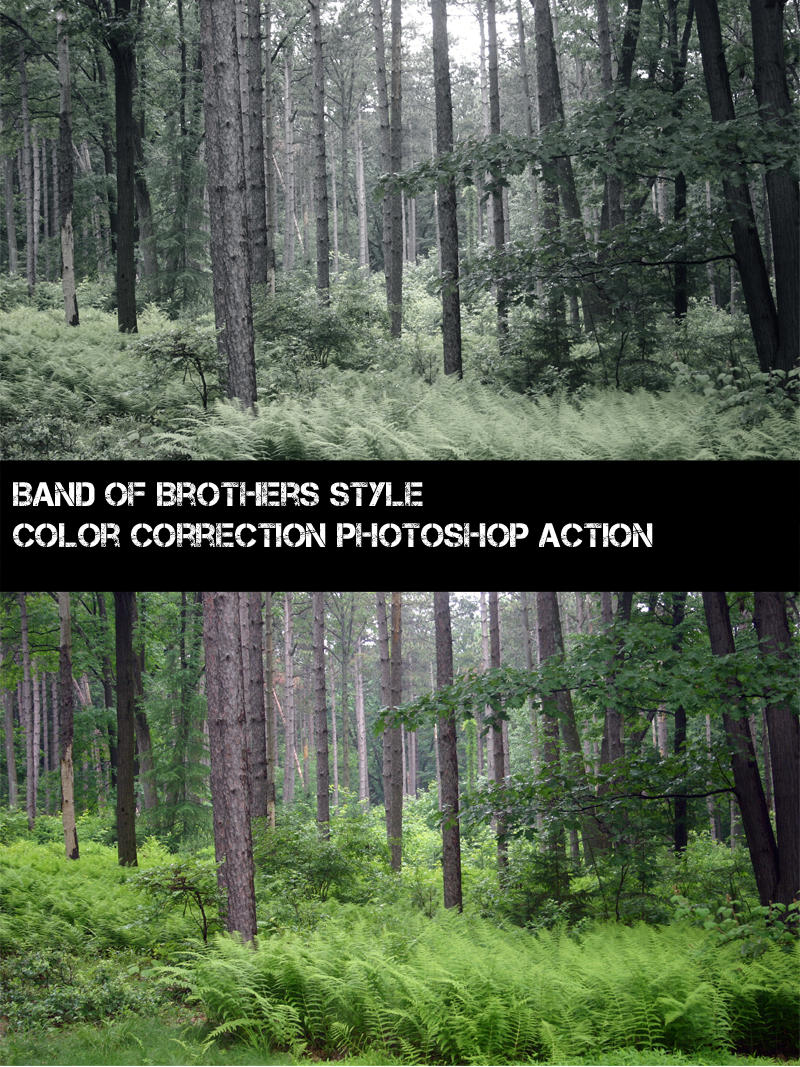
The color saturation - filter - is fine and I would like it to be turned up a notch like WoP and even some Crysis mods have. The colors give you the feeling as if you are in the 1940s sky over Britain and not flying a refurbished Spit/109 flying over Britain for a 2011 air show.
Why do you think Band of Brothers was such a success and copied by other movies and game studios? Who can forget Schindler's List?

Posted By: Winny
Re: Colors and saturation are way off - 02/27/11 12:53 AM
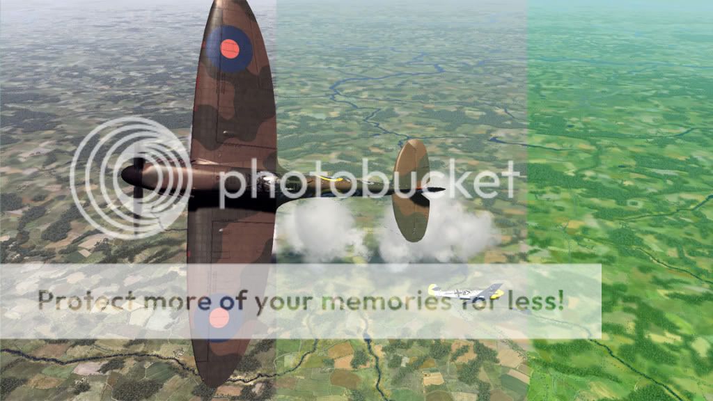
Ok here's my attempt to make CoD look like WoP.. It's easy, increase the contrast, a lot. Decrease the saturation, a little.
Mess about with the hue, for a bit... Ends up like this.
Please note: I'm not saying that I want it to look like this, but it does bring out a lot of detail that is hard to see otherwise

Seriously tho if I have one criticism of CoD it's that the blacks aren't black enough, but a quick tweak of your contrast settings sorts that out quite well. It's just a question of taste in the end, all the details seem to be there.
Posted By: dude163
Re: Colors and saturation are way off - 02/27/11 01:48 AM
I cant wait to play this and adjust the settings on my monitor if I have to

I can't wait to see you adjust the cockpit hood,pilot and model painting on 109 on your monitor.
I cant wait to not care about insignificant details
Posted By: Genbrien
Re: Colors and saturation are way off - 02/27/11 01:54 AM
http://cdn-www.airliners.net/aviation-photos/photos/2/7/5/0903572.jpg

The WOP one looks like the one in real photo,,, cannot be done??? real planes in 10 years? nay sayers pls go away.
The Oleg moddeler team were probably under influence of SpitGirl or some other 2 week vodka party.....
(and pls don't bring stupid argument that WOP is arcade, PROPER colors and modelling can be done in any game)
wtf are you talking about. The yellow in the WoP pic is not near close to the real one.....


Seriously dude, stop trolling

I know it's your favorite passtime, but get a life
Posted By: mazex
Re: Colors and saturation are way off - 02/27/11 02:15 AM
The screenshot looks identical to the photo. Notice the photo is presenting the shadow side of the plane. The screenshot is presenting the sunny side of the plane.
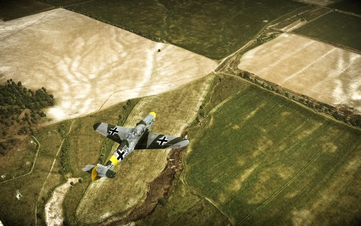
Exactly... Let's compare some other shots of the same real plane with Olegs friggin excellent 109...


Throwing pearls before... ?
Posted By: mazex
Re: Colors and saturation are way off - 02/27/11 02:42 AM
The WOP one looks like the one in real photo,,, cannot be done??? real planes in 10 years? nay sayers pls go away.
The Oleg moddeler team were probably under influence of SpitGirl or some other 2 week vodka party.....
(and pls don't bring stupid argument that WOP is arcade, PROPER colors and modelling can be done in any game)
Have you have calibrated the colors of your monitor? I just don't understand how you can think that the Band of Brothers sepia nuked WOP shot looks more "real" than the CoD beta?
And by the way - if you understand diddley about white balance in photos - please have a look again at the "evidence photo" you presented... A hint, look at stuff you KNOW should be pure white like the text "14" on the side and see if it is clean white...
Posted By: Novotny
Re: Colors and saturation are way off - 02/27/11 02:50 AM
Mazex you're just a fanboyx. And your apparently 'real' 109 has no hood fasteners.
Posted By: VonBarb.
Re: Colors and saturation are way off - 02/27/11 03:27 AM
Have you seriously nothing better to do or complain about ?
-Those yellow wingtips are squad specific markings that not all Emils involved in the BoB sported. Hence why they're not there on the DoD planes from the pic.
-The camo pattern is a just a camouflage pattern, by the end of the Summer of 1940 you couldn't have found a pair of 109s that sported the exact same pattern due to panels being replaced and worn out paint being painted over, and there were many different factory and field applied pattern variations. Several of these are represented in DoD as evidenced by other preview screens. Don't like this one ? pick another !
Your complain equals posting just one screenshot to comlain about how RAF fighters seem to all sport a Type A pattern and then argue Oleg's wrong by posting just one other picture of another plane painted in the Type B pattern.
-Who's to say which of the screenshot or the pic is wrong ? Can you prove with absolute certainty that no filters/edits were used on the pic ?
-That shadow/lighting argument : Season ? Time of day ? Light side or Shadow side ? The screenshot and the pic could represent very different settings.
That 'real picture' is a picture of a restored 109, and is not from 1940. LW historians and skinners have been pulling their hair out for years about the proper shades of LW camouflage and markings, especially the field applied camos and recognition marks. And everytime they think they got it right, some new evidence pops up proving them wrong.
Accurate photo evidence from that era is very hard to find. Pics from back then were in black and white, when not sepia, colour photography still being somewhat of an obscure science except for a few rare shots, and there was nothing genuine from that era left to take pictures of by the time they invented digital photography. Some thorough research has to be done when attempting to paint an aircraft as accurately as possible, and the results are often quite surprising : For instance, did you know the Red Baron was more likely the 'Dark Orange' Baron ? Knowing that, would you like your Richtoffen Dreidecker in RoF painted Orange for accuracy, or Red because it feels more 'right' according to your own personnal idea of how it should look ? Was the late war 'Grauviolet' more Grau or was it rather Violet ? Could you describe to me what the RAF SkyS colour used in 1940 looked like ?
So look up the 'LW Yellow' (or any other early war LW colours for that matter) on skinning and scale modelling websites, the actual shades might not be exactly what you had in mind.
The colours displayed in the pics represent the most commonly accepted consensus about LW colours from that era, and they look just fine by me. Besides, as someone pointed out before, this is the result of a modelling job that had to include some part of personnal interpretation at some stage (which is the beauty of it, and makes you prefer some skins over others, some skins artists' style more appealing to you than others...), and they got it just right IMO : everything fits nicely together and looks as accurate as I personally could have hoped from a sim that's been years in the making.
But please note that is just my personnal opinion, that I realise is based on much more interrogations than concrete answers, and Oleg's interpretation of things just happens to be somewhat close to my own. What kind of evidence do you have that is so strong it can back up your claim that the colours are all as wrong as you think they are ?
Perhaps some of the seasonned skinners out there who spent copious time researching the subject for their projects would like to make a comment which would be -no doubt- a lot more educated than mine or nuggetx's ?
In any case, those paintjobs and colours look a lot more convincing and a hell of a lot better researched than any default LW skins in Il-2, and that's a very good surprise indeed for vanilla textures.
Cheers
Nico
Posted By: Dart
Re: Colors and saturation are way off - 02/27/11 04:15 AM
Please no pea soup filter like in WoP. Worst gimmick since lens flare.
And 1940 GB had the same levels of color saturation as 2011 GB. They didn't suddenly invent a richer pallet for Planet Earth in the 1950's.
Posted By: FozzyBear
Re: Colors and saturation are way off - 02/27/11 05:19 AM
Please no pea soup filter like in WoP. Worst gimmick since lens flare.
And 1940 GB had the same levels of color saturation as 2011 GB. They didn't suddenly invent a richer pallet for Planet Earth in the 1950's.
I'm telling you why movie produces, photographers, and game developers - mainly those that produce console games - use filters. It gives you the feeling you are back in time and not flying in 2011 GB fighting the imaginary Luftwaffe. I'm also sure it does more than give you a historical experience, but it might also help with performance and hiding flaws.
Have you have calibrated the colors of your monitor? I just don't understand how you can think that the Band of Brothers sepia nuked WOP shot looks more "real" than the CoD beta?
No one is arguing that it looks real or realistic. What we are saying, well most of us anyway, is that it looks more believable. The colors set the mood of being back in the 1940s.
Why is that? Maybe Band of Brothers and even the Memphis Belle has a lot to do with it.
And by the way - if you understand diddley about white balance in photos - please have a look again at the "evidence photo" you presented... A hint, look at stuff you KNOW should be pure white like the text "14" on the side and see if it is clean white...
In all honesty, photography has changed a lot since the 1990s. No one really uses W/B anymore, unless you are a wedding photographer.
More and more photographers and video gurus are going for that 1970s film look.
http://fc04.deviantart.net/fs71/f/2010/195/7/a/Follow_by_kyu_to.jpg
Posted By: citizen guod
Re: Colors and saturation are way off - 02/27/11 05:31 AM
Exactly... Let's compare some other shots of the same real plane with Olegs friggin excellent 109...

Yeah, but the GRASS is too green in the photo!
LMAO.
mazex 1
nuggetx 0
Posted By: citizen guod
Re: Colors and saturation are way off - 02/27/11 05:34 AM
Please no pea soup filter like in WoP. Worst gimmick since lens flare.
And 1940 GB had the same levels of color saturation as 2011 GB. They didn't suddenly invent a richer pallet for Planet Earth in the 1950's.
Yeah, and Bob Guccione is dead so leave behind the smeared Vaseline on the lens look.

Posted By: Freycinet
Re: Colors and saturation are way off - 02/27/11 06:21 AM
Have you have calibrated the colors of your monitor? I just don't understand how you can think that the Band of Brothers sepia nuked WOP shot looks more "real" than the CoD beta?
No one is arguing that it looks real or realistic. What we are saying, well most of us anyway, is that it looks more believable. The colors set the mood of being back in the 1940s.
Why is that? Maybe Band of Brothers and even the Memphis Belle has a lot to do with it.
But, but, but... - We don't want to play a sim that looks like an old movie, do we? As if colours didn't exist back in 1940. Children the age of 8 and below might think that, when they look at B/W photos, but surely the rest of humanity agrees that a sim should just have lifelike present-day colours, even though it is placed in 1940?
BTW, I think they chose that canopy version for reasons of visibility. The other, heavier canopy would be quite easy to look out of in Real Life, because pilots can just move their heads around. In a sim, even for those of us with TIR, it would be an unrealistically annoying impediment to our view of the outside world.
Since both canopy types existed and were used in the BoB they went for the one with max. visibility. My guess, anyway.
Posted By: Flyboy4612
Re: Colors and saturation are way off - 02/27/11 06:45 AM
I've been watching this forum for years and have been amused by a lot of the complaints that arise. This one takes the cake. I think Oleg's 109 looks terrific. To give everyone some perspective of how far combat sims have come, this is an image of a BF-109 I flew way back during my Combat Flight Simulator 1 days. Look! No hood fasteners and the color saturation is all wrong. Guess what, I enjoyed the heck out of the game!

No game will ever be flawless. We should all just be thankful these games are being made in the first place. If you don't like how it's being made, perhaps your time would be better invested in college courses so you can learn how to produce your own flight simulator instead of whining about what you don't like on forums.
Posted By: monsterZER0
Re: Colors and saturation are way off - 02/27/11 06:48 AM
I've been watching this forum for years and have been amused by a lot of the complaints that arise. This one takes the cake. I think Oleg's 109 looks terrific. To give everyone some perspective of how far combat sims have come, this is an image of a BF-109 I flew way back during my Combat Flight Simulator 1 days. Look! No hood fasteners and the color saturation is all wrong. Guess what, I enjoyed the heck out of the game!

No game will ever be flawless. We should all just be thankful these games are being made in the first place. If you don't like how it's being made, perhaps your time would be better invested in college courses so you can learn how to produce your own flight simulator instead of whining about what you don't like on forums.
+1
Well said.
Posted By: Lixma
Re: Colors and saturation are way off - 02/27/11 07:14 AM
Interestingly the only thing correct about that CFS 109 is the pilot's head.
Posted By: IV/JG7trumps
Re: Colors and saturation are way off - 02/27/11 07:31 AM
+1 i'm dissapointed that such little attention has been put into proper modelling of planes.
also notice that the green camo in photo goes along the end of the hood to the tail, in the Oleg version it cuts off goes up and then to the end of the tail, it looks ugly, the wingtips are also not yellow.
Bud, i really do feel sorry for you, to go through life with the expectations that you have must lead to more dissapointment and misery than joy, to suggest that the devs of what will no doubt be the best WWII combat sim have no interest in modeling the plane correctly is just plain ridiculous! most of us can't wait to get our hands on it, maybe you should save yourself from more disapointment and pass on this one, i am sure it won't be long until some one develops a sim that meets your approval and personal opinion on all facets of the game. maybe you can become part of the dev team and be in charge of the green and yellow colours department just to make sure it's PERFECT.
Cya, wouldn't want to be ya!
Craig
Posted By: LukeFF
Re: Colors and saturation are way off - 02/27/11 08:57 AM
But, but, but... - We don't want to play a sim that looks like an old movie, do we? As if colours didn't exist back in 1940. Children the age of 8 and below might think that, when they look at B/W photos, but surely the rest of humanity agrees that a sim should just have lifelike present-day colours, even though it is placed in 1940?
+1
I want the colors to replicate (as is most reasonable) what the human eye sees, not what a film camera of 1940s vintage saw.
Posted By: Anonymous
Re: Colors and saturation are way off - 02/27/11 09:31 AM
But, but, but... - We don't want to play a sim that looks like an old movie, do we? As if colours didn't exist back in 1940. Children the age of 8 and below might think that, when they look at B/W photos, but surely the rest of humanity agrees that a sim should just have lifelike present-day colours, even though it is placed in 1940?
+1
I want the colors to replicate (as is most reasonable) what the human eye sees, not what a film camera of 1940s vintage saw.
Or the opinion of some director somewhere.
Let's all #%&*$# and moan about the lack of minute features making CoD completely unrealistic and then #%&*$# and moan that it lacks features that make it even more unrealistic, Oleg cannot win whatever he does

Now everybody who is getting worked up over colour, saturation and all that needs to remember that colour and our perception of it depends heavily on its surroundings and I don't just mean the immediate environment of the screen.
Square A is way off, it should be more like square B!!! I'm not buying it now until Oleg fixes it!!! Oh wait a minute...

Posted By: CHDT
Re: Colors and saturation are way off - 02/27/11 10:24 AM
As I repeat everywhere, "please, developers, gamma settings within the game setup", not everybody likes too vivid colors.
Posted By: Nikko
Re: Colors and saturation are way off - 02/27/11 10:52 AM
This thread is unbelievable

I wonder if WoP took this exact photo as a base for its Bf-109 skin?
Some guy should really take classes in photography and colors, weather... I know there are obvious trolls anyway.
I don't like filters. I don't want to be in a movie, I want to be in 1940 for real. Some days the color are brighter. Some days the color are darker. But they are not sepia and grainy. I asked my grandfather. He confirmed.
If you like more action movie/nostalgia rendering, I guess wait for the WoP equivalent ( in 6 years ).
Posted By: VaiHalen
Re: Colors and saturation are way off - 02/27/11 10:58 AM
Ok here's my attempt to make CoD look like WoP.. It's easy, increase the contrast, a lot. Decrease the saturation, a little.
Mess about with the hue, for a bit... Ends up like this.
Please note: I'm not saying that I want it to look like this, but it does bring out a lot of detail that is hard to see otherwise

Seriously tho if I have one criticism of CoD it's that the blacks aren't black enough, but a quick tweak of your contrast settings sorts that out quite well. It's just a question of taste in the end, all the details seem to be there.
I really like the picture with your photoshop editing. I'm wondering if it's possible to have all this while playing a game. I mean, is possible adjust all this in the graphic card control center (I have an Ati card) and then play a game with those settings? I can set the contrast, saturation... but hue??
And, could you tell me how did you set the hue?
Thank you for your time, the picture you edited is just wonderful. It looks just real!
Posted By: VaiHalen
Re: Colors and saturation are way off - 02/27/11 11:20 AM
Here is my try:

CoD has maibe too much cyan and green. I incremented red and a little magenta.
Posted By: mazex
Re: Colors and saturation are way off - 02/27/11 11:27 AM
Have you seriously nothing better to do or complain about ?
-Those yellow wingtips are squad specific markings that not all Emils involved in the BoB sported. Hence why they're not there on the DoD planes from the pic.
-The camo pattern is a just a camouflage pattern, by the end of the Summer of 1940 you couldn't have found a pair of 109s that sported the exact same pattern due to panels being replaced and worn out paint being painted over, and there were many different factory and field applied pattern variations. Several of these are represented in DoD as evidenced by other preview screens. Don't like this one ? pick another !
Your complain equals posting just one screenshot to comlain about how RAF fighters seem to all sport a Type A pattern and then argue Oleg's wrong by posting just one other picture of another plane painted in the Type B pattern.
-Who's to say which of the screenshot or the pic is wrong ? Can you prove with absolute certainty that no filters/edits were used on the pic ?
-That shadow/lighting argument : Season ? Time of day ? Light side or Shadow side ? The screenshot and the pic could represent very different settings.
That 'real picture' is a picture of a restored 109, and is not from 1940. LW historians and skinners have been pulling their hair out for years about the proper shades of LW camouflage and markings, especially the field applied camos and recognition marks. And everytime they think they got it right, some new evidence pops up proving them wrong.
Accurate photo evidence from that era is very hard to find. Pics from back then were in black and white, when not sepia, colour photography still being somewhat of an obscure science except for a few rare shots, and there was nothing genuine from that era left to take pictures of by the time they invented digital photography. Some thorough research has to be done when attempting to paint an aircraft as accurately as possible, and the results are often quite surprising : For instance, did you know the Red Baron was more likely the 'Dark Orange' Baron ? Knowing that, would you like your Richtoffen Dreidecker in RoF painted Orange for accuracy, or Red because it feels more 'right' according to your own personnal idea of how it should look ? Was the late war 'Grauviolet' more Grau or was it rather Violet ? Could you describe to me what the RAF SkyS colour used in 1940 looked like ?
So look up the 'LW Yellow' (or any other early war LW colours for that matter) on skinning and scale modelling websites, the actual shades might not be exactly what you had in mind.
The colours displayed in the pics represent the most commonly accepted consensus about LW colours from that era, and they look just fine by me. Besides, as someone pointed out before, this is the result of a modelling job that had to include some part of personnal interpretation at some stage (which is the beauty of it, and makes you prefer some skins over others, some skins artists' style more appealing to you than others...), and they got it just right IMO : everything fits nicely together and looks as accurate as I personally could have hoped from a sim that's been years in the making.
But please note that is just my personnal opinion, that I realise is based on much more interrogations than concrete answers, and Oleg's interpretation of things just happens to be somewhat close to my own. What kind of evidence do you have that is so strong it can back up your claim that the colours are all as wrong as you think they are ?
Perhaps some of the seasonned skinners out there who spent copious time researching the subject for their projects would like to make a comment which would be -no doubt- a lot more educated than mine or nuggetx's ?
In any case, those paintjobs and colours look a lot more convincing and a hell of a lot better researched than any default LW skins in Il-2, and that's a very good surprise indeed for vanilla textures.
Cheers
Nico
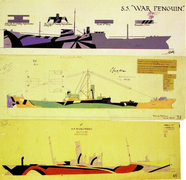
Well said. Another interesting thing is how the WWI razzle dazzle camo for ships looked in reality:

Not what most people would think? Whine whine - it should be different shades of gray like in that movie I saw!
Posted By: Lancelot
Re: Colors and saturation are way off - 02/27/11 11:29 AM
Have you seriously nothing better to do or complain about ?
-Those yellow wingtips are squad specific markings that not all Emils involved in the BoB sported. Hence why they're not there on the DoD planes from the pic.
-The camo pattern is a just a camouflage pattern, by the end of the Summer of 1940 you couldn't have found a pair of 109s that sported the exact same pattern due to panels being replaced and worn out paint being painted over, and there were many different factory and field applied pattern variations. Several of these are represented in DoD as evidenced by other preview screens. Don't like this one ? pick another !
Your complain equals posting just one screenshot to comlain about how RAF fighters seem to all sport a Type A pattern and then argue Oleg's wrong by posting just one other picture of another plane painted in the Type B pattern.
-Who's to say which of the screenshot or the pic is wrong ? Can you prove with absolute certainty that no filters/edits were used on the pic ?
-That shadow/lighting argument : Season ? Time of day ? Light side or Shadow side ? The screenshot and the pic could represent very different settings.
That 'real picture' is a picture of a restored 109, and is not from 1940. LW historians and skinners have been pulling their hair out for years about the proper shades of LW camouflage and markings, especially the field applied camos and recognition marks. And everytime they think they got it right, some new evidence pops up proving them wrong.
Accurate photo evidence from that era is very hard to find. Pics from back then were in black and white, when not sepia, colour photography still being somewhat of an obscure science except for a few rare shots, and there was nothing genuine from that era left to take pictures of by the time they invented digital photography. Some thorough research has to be done when attempting to paint an aircraft as accurately as possible, and the results are often quite surprising : For instance, did you know the Red Baron was more likely the 'Dark Orange' Baron ? Knowing that, would you like your Richtoffen Dreidecker in RoF painted Orange for accuracy, or Red because it feels more 'right' according to your own personnal idea of how it should look ? Was the late war 'Grauviolet' more Grau or was it rather Violet ? Could you describe to me what the RAF SkyS colour used in 1940 looked like ?
So look up the 'LW Yellow' (or any other early war LW colours for that matter) on skinning and scale modelling websites, the actual shades might not be exactly what you had in mind.
The colours displayed in the pics represent the most commonly accepted consensus about LW colours from that era, and they look just fine by me. Besides, as someone pointed out before, this is the result of a modelling job that had to include some part of personnal interpretation at some stage (which is the beauty of it, and makes you prefer some skins over others, some skins artists' style more appealing to you than others...), and they got it just right IMO : everything fits nicely together and looks as accurate as I personally could have hoped from a sim that's been years in the making.
But please note that is just my personnal opinion, that I realise is based on much more interrogations than concrete answers, and Oleg's interpretation of things just happens to be somewhat close to my own. What kind of evidence do you have that is so strong it can back up your claim that the colours are all as wrong as you think they are ?
Perhaps some of the seasonned skinners out there who spent copious time researching the subject for their projects would like to make a comment which would be -no doubt- a lot more educated than mine or nuggetx's ?
In any case, those paintjobs and colours look a lot more convincing and a hell of a lot better researched than any default LW skins in Il-2, and that's a very good surprise indeed for vanilla textures.
Cheers
Nico
GREAT post, well said!. +1
Posted By: GloDark7
Re: Colors and saturation are way off - 02/27/11 01:00 PM
Please no pea soup filter like in WoP. Worst gimmick since lens flare.
Damn you chlorophyll! I always thought it was spot on in WoP.
What colour other than a predominance of green for the English countryside?

Posted By: Dart
Re: Colors and saturation are way off - 02/27/11 01:46 PM
Grass is green. Trees are green. White is not green. Skies do not have a green tint. In WoP they really, really overdid the color filter effect for my tastes.
The Real World(tm) is not monocromed unless one is wearing green sunglasses.
Posted By: dude163
Re: Colors and saturation are way off - 02/27/11 01:50 PM
Please no pea soup filter like in WoP. Worst gimmick since lens flare.
And 1940 GB had the same levels of color saturation as 2011 GB. They didn't suddenly invent a richer pallet for Planet Earth in the 1950's.
Yeah, and Bob Guccione is dead so leave behind the smeared Vaseline on the lens look.

Oh, it was vaseline? muahahahaaha
Posted By: T}{OR
Re: Colors and saturation are way off - 02/27/11 01:56 PM
I have to say, this thread is very amusing to say the least.

Here is a render of 109 e3 from WOP. Which was done with more attention to details (proper green camo, yellow wingtips, not so white color on hood [yellow is still there tho]), even the pilot looks much more natural, overall much better than Il-2.

&
Please no pea soup filter like in WoP. Worst gimmick since lens flare.
Damn you chlorophyll! I always thought it was spot on in WoP.
What colour other than a predominance of green for the English countryside?

Like watching Cartoon Network lol, I don't know what you guys are seeing but this is what it looks to me IMO. I will go with what Dart said.
I cant wait to play this and adjust the settings on my monitor if I have to

Heretic, everybody knows that all monitors are calibrated at the factory to display the exact same colours regardless of make, model or local light conditions.
I have but one question: have you ever heard about expensive monitor calibrators? TN/IPS/S-PVA panels and their differences?
Ok here's my attempt to make CoD look like WoP.. It's easy, increase the contrast, a lot. Decrease the saturation, a little.
Mess about with the hue, for a bit... Ends up like this.
Please note: I'm not saying that I want it to look like this, but it does bring out a lot of detail that is hard to see otherwise

Seriously tho if I have one criticism of CoD it's that the blacks aren't black enough, but a quick tweak of your contrast settings sorts that out quite well. It's just a question of taste in the end, all the details seem to be there.
Not saying that Oleg's screen shot is perfect, far from it - but this photoshop edit is terrible IMO. I would hate if the game looked like that - a worn out picture.
The screenshot looks identical to the photo. Notice the photo is presenting the shadow side of the plane. The screenshot is presenting the sunny side of the plane.
Exactly... Let's compare some other shots of the same real plane with Olegs friggin excellent 109...


Throwing pearls before... ?
What am I seeing here? Definitely not an 1940 Emil.
Posted By: BKHZ_Furbs
Re: Colors and saturation are way off - 02/27/11 02:10 PM
Please no pea soup filter like in WoP. Worst gimmick since lens flare.
Damn you chlorophyll! I always thought it was spot on in WoP.
What colour other than a predominance of green for the English countryside?

Agreed with the green filter...BUT...the shape and layout of the trees and fields and just that nothing else still looks better than COD to me.
Posted By: GloDark7
Re: Colors and saturation are way off - 02/27/11 02:27 PM
Grass is green. Trees are green. White is not green. Skies do not have a green tint. In WoP they really, really overdid the color filter effect for my tastes.
The Real World(tm) is not monocromed unless one is wearing green sunglasses.
I guess we'll agree to disagree. I don't see a Matrix-style green filter in WoP. Just green where it should be: trees, fields, grass. Skies are generally light-blue (dependent on weather), clouds are white. Semi-transparent clouds do look green when you're above them looking through to the lush green, English countryside below


Posted By: Philip_ed
Re: Colors and saturation are way off - 02/27/11 02:32 PM
Out of interest, how can anyone comment saying that the team have nailed it 100% right? And similarly how can anyone say that it isn't 100% right?
It's all perception, really. When the player gets the game, they should be able to tweak it to whatever degree they want without having the fan-boy party knocking at their door, moaning at them for changing a game made by their God. Similarly, the fan-boys shouldn't be assaulted for wishing to preserve a game of beauty.
Now looking at the photoshop jobs done on the original picture, they look 'cool', but realistic? It's doubtful. However I think Winny is on to something with the fact that the shadows don't seem dark enough. but c'mon, just saying that sounds a bit pathetic. And that's the whole point. If you look at something for long enough, it's easy to pick it apart.
Perfection will never be reached 100%, but oppinions are useful for attempting to reach it.
Similarly, perfection can be reached for one person, but for another it may just be crap. That's why I agree that the game should have an easy way for the player to adjust colour and saturation. I have used third-party programs with Il-2 to do this, and it has worked remarkably well, so I hope that I can do this with SoW, just to have a play around.
At the end of the day, it's there for the player to enjoy to whatever extent they wish, and i think it's ridiculous that people are flamed for posting their own opinions of how they'd like the game to be.
Posted By: CHDT
Re: Colors and saturation are way off - 02/27/11 02:39 PM
" When the player gets the game, they should be able to tweak it to whatever degree they want..."
Yes, again, gamma and color settings within the game setup, please !
P.S. About this "I have used third-party programs with Il-2 to do this", can you name those programs, I used to use one long ago, but I'm unable to remember me the name !
Posted By: mazex
Re: Colors and saturation are way off - 02/27/11 03:00 PM
Well to get down into details a bit as I built scale models when I was young and remember the hell of getting the RLM colors right (or any color for that matter!)...
Many sources seem to agree that the factory paint scheme of the 109 E:s during mid 1940 was a camouflage pattern of RLM 02 (called Grau or Gr�ngrau) and RLM 71 (Dunkel Gr�n) on the upper surfaces and RLM 65 (Hell Blau) on the bottom and the sides of the fuselage, then a lot of field modifications where done mixing more grey in the greens, using RLM 70 instead of 71 etc...
Anyway - try finding a color correct version of these RLM colors for viewing on a PC monitor - or in paint for that matter! You will find many shades of green

Looking at this
RLM Chart for example it seems to match Olegs colors well, even though many have an RLM 02 that is more grey than that... Luftwaffe really experimented a lot with colors during the war and as the pigment of the planes that still exist in original paint has changed over the years - who really knows the true color of RLM 02? And then to make it look correct on a computer monitor in all kind of light situations? I think that Olegs attempt is great, maybe a little more grey in the 02 but who really knows?
/Mazex
Posted By: mazex
Re: Colors and saturation are way off - 02/27/11 03:10 PM
What am I seeing here? Definitely not an 1940 Emil.
Well, I simply found another image of the actual plane the original poster had used as a reference to show that colors don't look the same on different photos...
Posted By: Lixma
Re: Colors and saturation are way off - 02/27/11 03:24 PM
Agreed with the green filter...BUT...the shape and layout of the trees and fields and just that nothing else still looks better than COD to me.
Yep.
As Furbs said, it's the way the terrain has been put together that gives WoP its realistic look. From what i've seen no amount of messing about with saturation/gamma/HDR will help CoD's landscape look realistic. It's not a disaster or anything; and there may be very good technical reasons why CoD's terrain looks the way it does; and I doubt i'll care much about it during flight......still, it
is wrong.
Posted By: Novotny
Re: Colors and saturation are way off - 02/27/11 03:49 PM
I think Philip made a good point with regard to people claiming right and wrong: no matter how good the artist, or how brilliant the camera, or the processing, an image is necessarily a recreation of something; an impression. It can never be 100% exactly the same, or reflect perfectly the manner in which photons interact with the eyeball.
If we accept the logic behind that statement, then we cannot claim that anything in any image is 100% correct.
This behoves us to either damn everything as 'wrong' or to simply accept the flaws inherent to the porcess.
And to what degree should we accept flaws? That varies for every man, as is most clearly evinced on this and countless other forums. Should we argue over which is least wrong? Doesn't matter if we should or shouldn't, really. People will have preferences and will express them.
Personally, I only give a damn when I think people are rude, otherwise I usually just read everything with interest. Occasionally I'll express pleasure when I think something looks really cool. I'm not so arrogant as believe I've a better idea of how to recreate WW2 aircraft then the devs, so I never have any criticisms to make, though if I noticed an inaccuracy I'd certainly point it out. I like to think I'd so respectfully.
Anyways, the tl;dr version: everything's crap. I just don't care. Will still have fun.
Posted By: calmer133
Re: Colors and saturation are way off - 02/27/11 03:49 PM
Here is a render of 109 e3 from WOP. Which was done with more attention to details (proper green camo, yellow wingtips, not so white color on hood [yellow is still there tho]), even the pilot looks much more natural, overall much better than Il-2.

Yes, but WOP stinks as a flight sim.
Posted By: BKHZ_Furbs
Re: Colors and saturation are way off - 02/27/11 04:18 PM
Agreed again...think i played WOP for about 2 days, it indeed did suck as a sim

But thats not what were talking about and some of the aspects of the sim did impress me alot.
The layout of the fields, trees and the look of the tracers(not the wiggles) was very well done as were the clouds and the affect of flying through them.
also the look of the oil streaks from damaged planes(though a little over done)
Posted By: T}{OR
Re: Colors and saturation are way off - 02/27/11 04:18 PM
Well, I simply found another image of the actual plane the original poster had used as a reference to show that colors don't look the same on different photos...
Correct. Time of the day, overcast or clear weather, and various other factors impact on how the colors look. Take a photo of the same plane with the same camera and with the same settings in two different periods during the day and I guarantee you that they won't have the same shade of yellow.
Here is a render of 109 e3 from WOP. Which was done with more attention to details (proper green camo, yellow wingtips, not so white color on hood [yellow is still there tho]), even the pilot looks much more natural, overall much better than Il-2.

Yes, but WOP stinks as a flight sim.
So I have heard and seen from the YT videos.
Besides, IMO the IL2 Emil looks better than the one shown here. But this may be due to the level of details used on this particular photo.
Even if Oleg didn't get the color and paint scheme to how certain people wanted it - skinners will fix that in a blink of an eye. What can't be fixed immediately is the engine and individual cylinder, overheating and various internal system modeling, not to mention the complex damage model which is said to be 10x more detailed than what we are used to in IL2.
When all this is put into perspective, you can understand why some of us conceive these threads as pretty much pointless.
My advice to all of you who think that the grass doesn't look right or that the paint scheme is tad bit off - go out and have a beer or two and relax. That is, if you are old enough. If not, there are other means of entertainment.

Posted By: Georgio
Re: Colors and saturation are way off - 02/27/11 04:20 PM
To be honest I think that the colours look just fine. I especially like that the ariel perspective is now closer to what you actually see at altitude ; I.e. The hazing that limits the far perspective view.
What actually bothers me more is the complete lack of the swastika off the tail. I know it was the emblem of the Nazi party etc. Etc. But the plane just looks wrong without it. Couldn't it be shown but in reverse like the original Indian depictiion?
Posted By: Sluggish Controls
Re: Colors and saturation are way off - 02/27/11 05:10 PM
... What actually bothers me more is the complete lack of the swastika off the tail. I know it was the emblem of the Nazi party etc. Etc. But the plane just looks wrong without it. Couldn't it be shown but in reverse like the original Indian depictiion?
The swastika has been a no no in Germany for decades now so it won't be included in the sim. Not to worry, skinners will certainly take care of this starting on day-2 of official release.
Cheers,
Slug
Posted By: Para_Bellum
Re: Colors and saturation are way off - 02/27/11 05:40 PM
This is an old screenie I took in WoP a long time ago, on a 2+year old system.

Sorry, but to me this simply looks way better than anything I've seen so far from CoD. And the performance in WoP was excellent.
BTW I have no doubt that CoD will be the much better flightsim, but that's not the question.
Posted By: mazex
Re: Colors and saturation are way off - 02/27/11 05:42 PM
Well, I don't really understand what you mean by "not using" white balance? You mean that you don't care about it when taking the photo in RAW format? That is naturally correct and one of the main reasons that most photographers love the RAW format - you can adjust the white balance in a program like Photoshop Lightroom instead of doing it "in the field"... But anyway - a photographer that does not care about white balance today really has to have a camera that automatically sets the WB 100% correct all the time? Today the cameras sure are good at that but one of the first corrections I do to a RAW image is always to make sure that the WB is correct - or tweak it to achieve a warmer picture for effect

Especially when taking non-flash photos indoor the white balance is seldom perfect even on the best cameras.
If "no one really cares about W/B anymore" - the GUI designers at Adobe (who are acknowledged by some to know what they do) must be way off by placing WB corrections at the TOP of the GUI in Adobe Lightroom (see below)? If no one uses it any more, why not place it in the bottom?

Posted By: Old Dux
Re: Colors and saturation are way off - 02/27/11 05:49 PM
Dayglo lemon-yellow (ugh!) 109 has incorrect rudder outline. The aerial looks like an inverted telescope with the hausfrau heavy-duty washing line attached. No shading on spinner. Bad choice to make a point!
Posted By: mazex
Re: Colors and saturation are way off - 02/27/11 06:07 PM
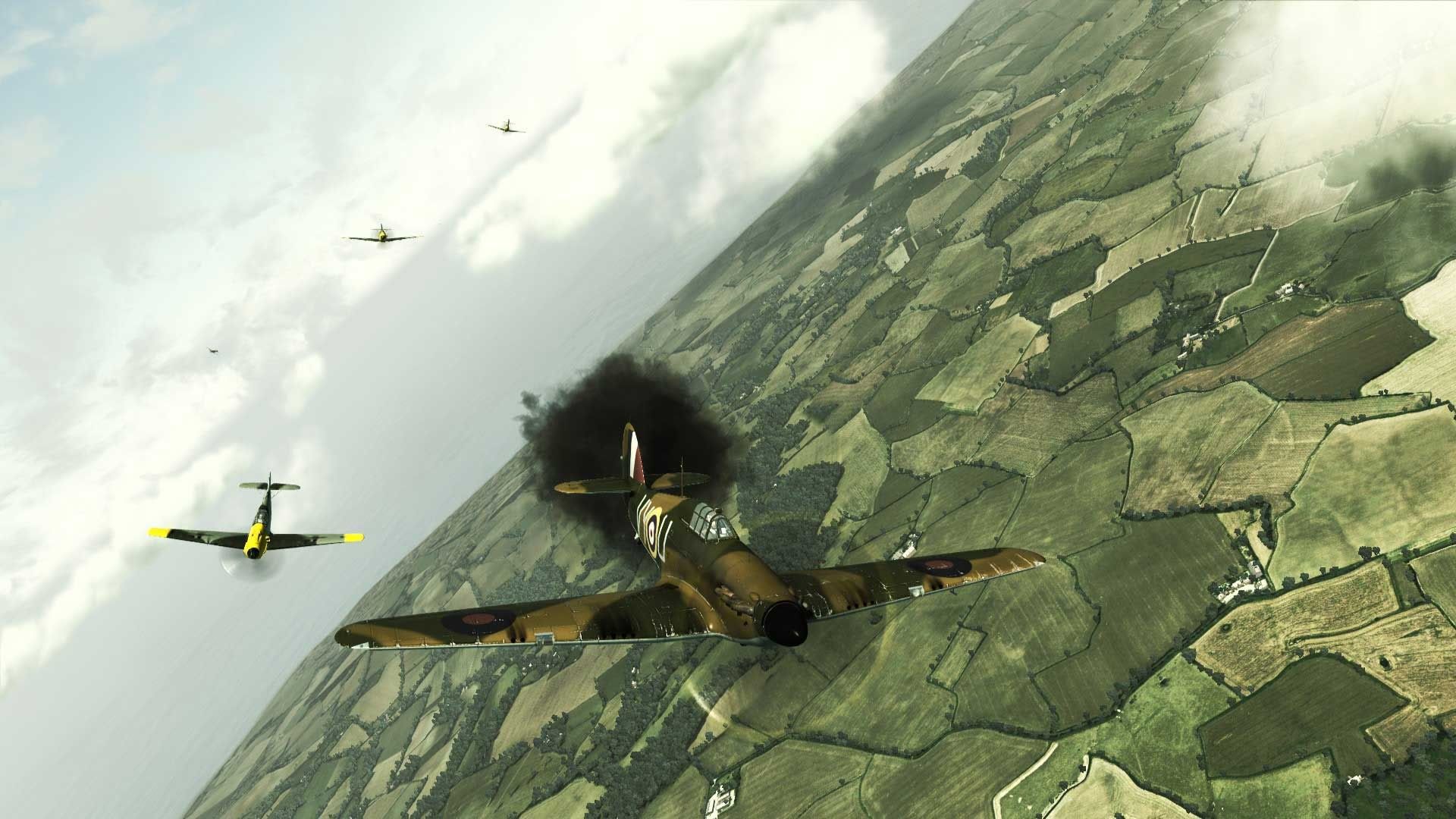
Besides, if it really should have the "real" WWII movie feeling should it not be like this instead?

Show this to you wife etc and let them decide if it's a real image or not

It actually would be fun to have a "Black and White" option under graphics - I don't think it would be hard to do... But on my prio list it's far down...
EDIT - added a bit of unsharpness on the 109:s for effect (especially the far ones), otherwise just bw with some adjustments to the different channels and a wiff of film grain...
Posted By: wheelsup_cavu
Re: Colors and saturation are way off - 02/27/11 06:11 PM
It would probably get old real quick but I like the look of the B&W picture. It does look more like how I remember seeing things about WW II.
The new colorized versions of the WW II films that they are showing on the military channel bug me to no end.
Wheels
Posted By: citizen guod
Re: Colors and saturation are way off - 02/27/11 06:47 PM
Out of interest, how can anyone comment saying that the team have nailed it 100% right? And similarly how can anyone say that it isn't 100% right?
Yep. The big problem is, anyone popping off without having their video card and monitor(s) calibrated are just firing blanks when they comment. Once the colors are calibrated, then there is a "correct" baseline to voice opinions.
Color correction is a whole science in itself. Some examples - The best time to view colors is when you first awake. As the day proceeds your visual color perception changes because the brain adds "more" to the daily color palette. The color coming in from the morning light is much different than the evening light color. The darker the room you're sitting in the less environmental impact it has on your color perception. Also, if you don't know the difference between additive and subtractive color, have never looked at a CIE color graph, Google it. It's all out there and easy to find.
Posted By: Winny
Re: Colors and saturation are way off - 02/27/11 06:47 PM
I'm not really sure how people can say the exact oposite of whats being shown..
Everyone's on about the 'green filter' in WoP but nobody's mentioned the fact that CoD is also very 'green heavy'
Left to right :- Less green/original/more green

Again I'm not trying to say it should be x y or Z. (personally I'll set CoD up so it's somewhere between less green and the original)
This is an exercise in showing what's already there..
Posted By: citizen guod
Re: Colors and saturation are way off - 02/27/11 06:58 PM
" When the player gets the game, they should be able to tweak it to whatever degree they want..."
Yes, again, gamma and color settings within the game setup, please !
P.S. About this "I have used third-party programs with Il-2 to do this", can you name those programs, I used to use one long ago, but I'm unable to remember me the name !
Do we really need them? Video cars and monitors are carrying profiles for games so we can do just that. Not an arguement over your point... just wondering if they're really required with what we already have to use.
Posted By: citizen guod
Re: Colors and saturation are way off - 02/27/11 07:00 PM
What next? Anacondas in trees?

Posted By: citizen guod
Re: Colors and saturation are way off - 02/27/11 07:15 PM
Some examples in this thread that people have tweaked still show a predominance of red casting. So the edit or suggested alternate images are based on incorrect color settings in the program to begin with.
 Reposting this link for assistance...
 LCD color calibration and testing screens.
http://www.lagom.nl/lcd-test/It includes with and without color profile screens. You do have a color profile set, right?

If you're using Windows 7, there is a good basic color calibration built in. Set it up if you haven't already and then go to the lagom.nl site.

Posted By: Ming_EAF19
Re: Colors and saturation are way off - 02/27/11 07:38 PM
Anacondas
lol
As long as the cockpit's not purple that's all
Ming
Posted By: Philip_ed
Re: Colors and saturation are way off - 02/27/11 07:48 PM
Winny, could you show a picture of CoD between Less green and the original? As Doug said, we all don't really have room to judge at this stage, but I'd be interested to see how that picture would look.
Quite an interesting topic now

Posted By: Winny
Re: Colors and saturation are way off - 02/27/11 07:52 PM
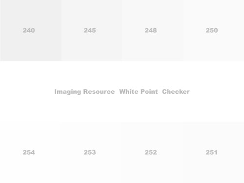
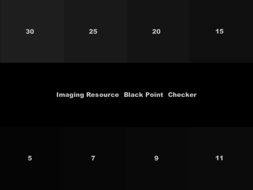
Nice quick brightness/contrast calibration test.
A really good monitor will show a difference between the central (pure white) bar and the block 254
A good monitor will show the boundary between the bar and 251.. If you're just seeing all white.. you've a problem.

For the shadows, Very Good monitor and you'll see the boundary between central (pure black) bar and block 5, a good one will show at 15, a lot don't differentiate till 30..

EDIT : you can adjust brightness and contrast to get better seperation, it's not an exact science but try to keep your white white and your black black.
Posted By: JAMF
Re: Colors and saturation are way off - 02/27/11 08:28 PM
On my laptop, I loose the edge after 251 and 9, but I'm happy with that result.
Posted By: GloDark7
Re: Colors and saturation are way off - 02/27/11 08:35 PM
Nice quick brightness/contrast calibration test.
A really good monitor will show a difference between the central (pure white) bar and the block 254
A good monitor will show the boundary between the bar and 251.. If you're just seeing all white.. you've a problem.
For the shadows, Very Good monitor and you'll see the boundary between central (pure black) bar and block 5, a good one will show at 15, a lot don't differentiate till 30..
Thanks Winny.
On the white I see gradation between 240 to 250, the difference of the central bar, but can't make out any gradation between 254 to 251.
On the black I see difference and gradation between all blocks.
When I got my monitor (LG LED V2420) I spent a good hour calibrating based on these tests -
http://www.lagom.nl/lcd-test/.
All done on the monitor controls, but I have 2 ATI profiles that adjust brightness slightly. One for daytime levels and one for night.
Glo
Posted By: Raspu86
Re: Colors and saturation are way off - 02/27/11 09:08 PM
Many people have gamma and brightness too much cranked up

Posted By: mazex
Re: Colors and saturation are way off - 02/27/11 09:25 PM
Nice quick brightness/contrast calibration test.
A really good monitor will show a difference between the central (pure white) bar and the block 254
A good monitor will show the boundary between the bar and 251.. If you're just seeing all white.. you've a problem.
For the shadows, Very Good monitor and you'll see the boundary between central (pure black) bar and block 5, a good one will show at 15, a lot don't differentiate till 30..
Good test - thought I had my monitor well calibrated but I had too loosen the Gamma a bit to get down all the way to 5 on the blacks while seeing at least the boundary at 252... I run a Samsung 2233RZ TN panel at home to get the 120Hz and fast gtg for gaming, but I'm sure my IPS at work will see all the boundarys... Hopefully

Posted By: Rodney
Re: Colors and saturation are way off - 02/27/11 10:01 PM
Some of you have a point, I adjusted the green channel and toned it down a bit and now at least the screen shot looks much better.I'll have to check wop and fsx.
Posted By: Anonymous
Re: Colors and saturation are way off - 02/27/11 10:50 PM
I have but one question: have you ever heard about expensive monitor calibrators? TN/IPS/S-PVA panels and their differences?
Yes, what on earth does that have to do with my sarcasm?
Posted By: Winny
Re: Colors and saturation are way off - 02/27/11 11:31 PM
Winny, could you show a picture of CoD between Less green and the original? As Doug said, we all don't really have room to judge at this stage, but I'd be interested to see how that picture would look.
Quite an interesting topic now

Ok, I try and stay away from opinions.. But when I get CoD, I'll set it up so it looks like this...ish depends how I feel on that day.

I prefer more contrast and less brigtness because grey blacks make things feel lightweight. That would be the one word I'd use to describe the look of CoD, but that's all it is, a look. It's not something the devs need to fix, it's something the user adjusts to suit taste.
All of this 'the colours are wrong' thing is pointless because you can fix it yourself (if you think it's broke). Just grab a screen shot, open it in windows, open the Graphics properties and mess around with everything till you like it more. Save it, repeat for next game, Simple.
Posted By: nuggetx
Re: Colors and saturation are way off - 02/27/11 11:42 PM
in Multiplayer i don't care about graphics,,,, i'll set my screen to 640x480 like in il-2 if it will help me spot cons from 6k alt

Posted By: Dart
Re: Colors and saturation are way off - 02/27/11 11:51 PM
This is an old screenie I took in WoP a long time ago, on a 2+year old system.
They can use flat photographs of bushes because in WoP one won't really be required to land - indeed, landing is pretty much forbidden in the game.
If CoD only did one little part of England I'd expect huge fidelity. But there's a whole lot more of the world generated in CoD. I hear the mythical land of France (noted on WoP maps as "Here Be Dragons" and "Terra Incognita") are actually in CoD.
Posted By: citizen guod
Re: Colors and saturation are way off - 02/28/11 12:05 AM
Nice quick brightness/contrast calibration test.
Excellent, Winny. Thanks!

Posted By: FozzyBear
Re: Colors and saturation are way off - 02/28/11 12:16 AM
Yep. The big problem is, anyone popping off without having their video card and monitor(s) calibrated are just firing blanks when they comment. Once the colors are calibrated, then there is a "correct" baseline to voice opinions.
Actually the problem is that people have different RGB settings in their browsers. If you use the default settings in Firefox, the images look highly saturated compared to IE or even Chrome. Images will look highly saturated in most Microsoft image viewers. This is why I use Irfanview to look at my graphics I make in Gimp or Photoshop.
There is an easy fix I have posted in the past to fix the RGBs in Firefox.
Well, I don't really understand what you mean by "not using" white balance? You mean that you don't care about it when taking the photo in RAW format? That is naturally correct and one of the main reasons that most photographers love the RAW format - you can adjust the white balance in a program like Photoshop Lightroom instead of doing it "in the field"... But anyway - a photographer that does not care about white balance today really has to have a camera that automatically sets the WB 100% correct all the time? Today the cameras sure are good at that but one of the first corrections I do to a RAW image is always to make sure that the WB is correct - or tweak it to achieve a warmer picture for effect

Especially when taking non-flash photos indoor the white balance is seldom perfect even on the best cameras.
If "no one really cares about W/B anymore" - the GUI designers at Adobe (who are acknowledged by some to know what they do) must be way off by placing WB corrections at the TOP of the GUI in Adobe Lightroom (see below)? If no one uses it any more, why not place it in the bottom?

I didn't elaborate because I figured no one would know what RAW and Light Room were. I didn't imply that a photographer should be a knuckled head and take a picture under Incandescent light with the W/B Florescent setting. However, I do often times use wrong W/B settings and have made some awesome images. I usually do that when I'm not at home to use Photoshop or Light Room or have a small memory card, which isn't good for RAW format
hey can use flat photographs of bushes because in WoP one won't really be required to land - indeed, landing is pretty much forbidden in the game.
As a 2d/3d artist, I don't know what you mean by "flat photographs." Most games, besides avatar and vehicle skins, use images with
Normal/Bump Mapping. Crysis uses something else, which I forget the name of, but its sort of similar.
Besides, IMO the IL2 Emil looks better than the one shown here. But this may be due to the level of details used on this particular photo.
That's because WoP is a console port. You are never going to see high poly models in current generation consoles. If you tried, you probably blow up your entire house once it tried to render them.
Posted By: FearlessFrog
Re: Colors and saturation are way off - 02/28/11 01:02 AM
Fozzy - I think Dart is referring to WoP using aerial photography edited with houses/trees where shopping centers are today, i.e. flat photo textures illusion is broken down low (see other thread for links).
Also, since I'm here now

the CryEngine 2 form of bumpmapping is the gloriously named 'Polybump' - a clever form of normal mapping.
Posted By: heady89
Re: Colors and saturation are way off - 02/28/11 01:17 AM
lul, nugget the trollzor is at it again with his l33t arguments.
Posted By: Winny
Re: Colors and saturation are way off - 02/28/11 01:40 AM
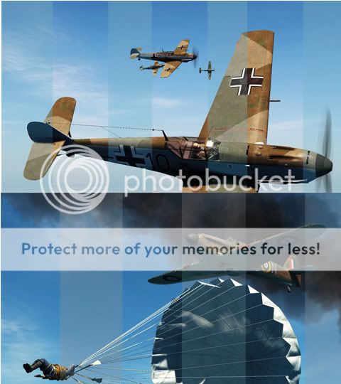
This is my last photoshop job, but worth looking at. If you're not bored already.

Light bands are the original, dark have very high contrast, that's all.
Most video cards have colour management, use it to get what you want out of CoD.
It's clearly a good looking game.
Posted By: VaiHalen
Re: Colors and saturation are way off - 02/28/11 10:08 AM
Winny I sent you a private message

Posted By: Ming_EAF19
Re: Colors and saturation are way off - 02/28/11 12:32 PM
They can use flat photographs of bushesDart may be talking here about the fact that one can take a shot of a bush, or create a 3D model of a bush. Then one can take two images of the bush/3d object, orthogonal/at 90 degrees. Use the alpha channel (transparency property) to have only the bush-structure now in the image. Texture a couple of polygons (at right angles to each other) with the bush images and rely on the user's graphics sub-system to show the 2D sprites as fairly decent-looking 3D bushes (from lots of angles but not from the straight down view, when there are no bushes below, just chickens)
Oleg uses this computerised tomography (as it were) technique to assemble his magnificent forests, which seen from above and from most angles look entirely convincing. Do not try to fly through the trees though because there are no trees. Just a world of hurt 
Many modern graphics cards can do object cloning/instantiation and they will need to for lots of bushes or even better, hedges/bocage

Ming
Posted By: Rodney
Re: Colors and saturation are way off - 02/28/11 01:12 PM
I've been perfectly happy with my colour settings with rof, wop, fsx for the past year but get a few screen shots of CoD and find I need to adjust them. Any chance Oleg and team
" God bless his name don't say it in vain" may actually have had their monitors set up differently during development? I have a few screenshots as my desktop background and have adjusted them to suit.
Posted By: Lixma
Re: Colors and saturation are way off - 02/28/11 03:38 PM
In Soviet Russia colours saturate you.
Posted By: RSColonel_131st
Re: Colors and saturation are way off - 02/28/11 04:36 PM
From my time as photographer, what I see in CoD shots seems too much contrast. Could be a result of HDR, as is often the case with today's games?
Posted By: Philip_ed
Re: Colors and saturation are way off - 02/28/11 04:37 PM
Winny, that shot of the spit looks great! to me, the landscape colours look perfect. However, as you say, it isn't an exact science. Looking at the 109 shot, you have altered the colours of the paintscheme quite dramatically. Although it's way too early to comment, i think that changes like this aren't always going to work. they affect the whole game, and thus can make one area look good, and another look worse. Similarly, the paintscheme of the Spit has been altered, and to me doesn't reflect the colours which I like. Still a great job though. We'll see how it is in a few weeks time.
In the perfect world, we'd be able to adjust the colour/saturation of the lansdscape, sky etc to suit our liking, but of course that is a lot to ask!
Posted By: Winny
Re: Colors and saturation are way off - 02/28/11 05:02 PM
Winny, that shot of the spit looks great! to me, the landscape colours look perfect. However, as you say, it isn't an exact science. Looking at the 109 shot, you have altered the colours of the paintscheme quite dramatically. Although it's way too early to comment, i think that changes like this aren't always going to work. they affect the whole game, and thus can make one area look good, and another look worse. Similarly, the paintscheme of the Spit has been altered, and to me doesn't reflect the colours which I like. Still a great job though. We'll see how it is in a few weeks time.
In the perfect world, we'd be able to adjust the colour/saturation of the lansdscape, sky etc to suit our liking, but of course that is a lot to ask!
I'm sure there's a happy medium for everyone, I did the 109 and Spit shots quickly and differently to each other. Just sliding sliders around.
Posted By: Slingn
Re: Colors and saturation are way off - 02/28/11 05:19 PM
i still say that the makers of this game have some artistic license to make the game in their own style. While we would all like a 100% accurate, and perfect military simulator, it just doesn't happen for the costs of a decent lunch. As pointed out in another thread, all we want is a good experience. In the end, it's still just cheap entertainment software.
Posted By: BKHZ_Furbs
Re: Colors and saturation are way off - 02/28/11 10:11 PM
Winny...when IT gets released...please post your colour settings because that looks just great.

Posted By: FozzyBear
Re: Colors and saturation are way off - 03/01/11 03:28 AM
Winny...when IT gets released...please post your colour settings because that looks just great.

It doesn't work like quit like that. Photoshop isn't going to generate you some specific variable that you can copy and paste into your video card, LCD/CRT settings.
Posted By: Compans
Re: Colors and saturation are way off - 03/01/11 04:23 AM
Posted By: Mizzy
Re: Colors and saturation are way off - 03/04/11 01:11 AM
Nugget
Shut up, there's a good chap

Mizzy

Posted By: Tiger27
Re: Colors and saturation are way off - 03/04/11 02:21 AM
I think you are going a bit overboard, are you sure the real photo is correct?
How would having a single colour off a bit (in your opinion) make the game an xbox imitation?
Posted By: DavidWa
Re: Colors and saturation are way off - 03/04/11 04:16 AM

can you say Beta with some POS system posting the shot.

I bet it looks 10x better on my system...
i7 930 running at 4.0 gig on air, 12 gigs of ddr3, 480gtx overclocked.. will get 2nd one if SLI works in Cliffs. 120gig SSD. and 3 500 gig standard drives. On Win 7 64bit. with my 42" 240hz LED .
Posted By: Mizzy
Re: Colors and saturation are way off - 03/04/11 07:31 PM
Can't we all just wait for the game to come out, probably optimised with whatever colour but this sort of critical nonsense does nothing but make one look foolish. I have modded games and done artwork for most simulations over the years and been a partner of ED with Black Shark and all this is.....is nothing but artwork and changeable, so keep calm and move on. God only knows what this place is going to be like when the game actually comes out!
Mizzy
