|
#3219331 - 02/26/11 10:06 PM
 Re: Colors and saturation are way off
[Re: nuggetx]
Re: Colors and saturation are way off
[Re: nuggetx]
|
Joined: Jan 2002
Posts: 6,623
Mogster

Hotshot
|
Hotshot
Joined: Jan 2002
Posts: 6,623
England
|
The CoD 109 has far greater detail, the lighting in the CoD shot is much better, more natural. The CoD 109 just needs a better, slightly weathered, skin.
I agree the WOP pilot looks better.
WAS C2D 8500 3.16ghz, 285gtx 1gb, 4gig ram, XP NOW Win7 64, I5 2500K, SSD, 8Gig ram, GTX 570
|
|
|
#3219388 - 02/26/11 11:34 PM
Re: Colors and saturation are way off
[Re: dude163]
|
**DONOTDELETE**
Unregistered
|
anon
Unregistered
|
I cant wait to play this and adjust the settings on my monitor if I have to  Heretic, everybody knows that all monitors are calibrated at the factory to display the exact same colours regardless of make, model or local light conditions.
|
|
|
#3219432 - 02/27/11 12:29 AM
Re: Colors and saturation are way off
[Re: nuggetx]
|
Joined: Feb 2011
Posts: 446
FozzyBear
Member
|
Member
Joined: Feb 2011
Posts: 446
|
I cannot believe that color and saturation were made so the planes look like some plasteel toys.
Look at the yellow nose, the bloom , color and lightning is WAY OFF. The color saturation - filter - is fine and I would like it to be turned up a notch like WoP and even some Crysis mods have. The colors give you the feeling as if you are in the 1940s sky over Britain and not flying a refurbished Spit/109 flying over Britain for a 2011 air show. Why do you think Band of Brothers was such a success and copied by other movies and game studios? Who can forget Schindler's List? 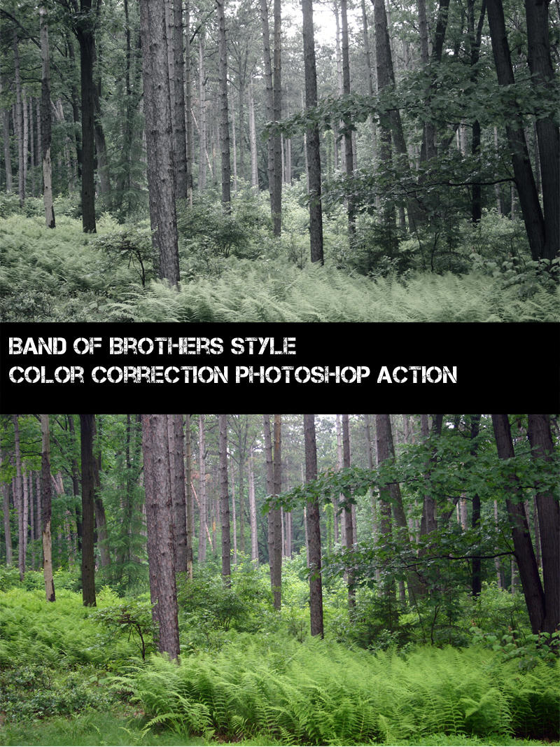
Last edited by FozzyBear; 02/27/11 12:39 AM.
|
|
|
#3219453 - 02/27/11 12:53 AM
Re: Colors and saturation are way off
[Re: nuggetx]
|
Joined: Jan 2011
Posts: 129
Winny
Member
|
Member
Joined: Jan 2011
Posts: 129
|
Ok here's my attempt to make CoD look like WoP.. It's easy, increase the contrast, a lot. Decrease the saturation, a little. Mess about with the hue, for a bit... Ends up like this. Please note: I'm not saying that I want it to look like this, but it does bring out a lot of detail that is hard to see otherwise  Seriously tho if I have one criticism of CoD it's that the blacks aren't black enough, but a quick tweak of your contrast settings sorts that out quite well. It's just a question of taste in the end, all the details seem to be there.
|
|
|
#3219483 - 02/27/11 01:48 AM
Re: Colors and saturation are way off
[Re: nuggetx]
|
Joined: Oct 2001
Posts: 8,357
dude163
Hotshot
|
Hotshot
Joined: Oct 2001
Posts: 8,357
riverview, NB, Canada
|
I cant wait to play this and adjust the settings on my monitor if I have to I can't wait to see you adjust the cockpit hood,pilot and model painting on 109 on your monitor. I cant wait to not care about insignificant details
|
|
|
#3219486 - 02/27/11 01:54 AM
Re: Colors and saturation are way off
[Re: nuggetx]
|
Joined: May 2009
Posts: 1,496
Genbrien
Stick to the plan man!
|
Stick to the plan man!
Member
Joined: May 2009
Posts: 1,496
Quebec, Canada
|
http://cdn-www.airliners.net/aviation-photos/photos/2/7/5/0903572.jpg 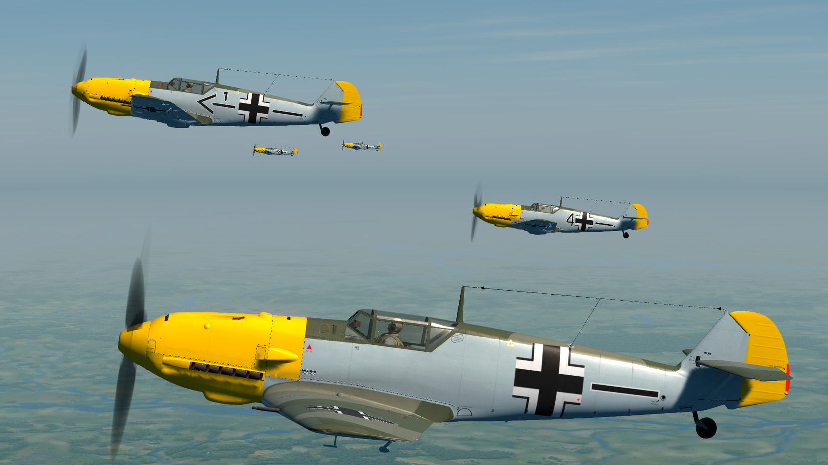 The WOP one looks like the one in real photo,,, cannot be done??? real planes in 10 years? nay sayers pls go away. The Oleg moddeler team were probably under influence of SpitGirl or some other 2 week vodka party..... (and pls don't bring stupid argument that WOP is arcade, PROPER colors and modelling can be done in any game) wtf are you talking about. The yellow in the WoP pic is not near close to the real one.....   Seriously dude, stop trolling  I know it's your favorite passtime, but get a life
XBL/PSN/others: genbrien
Mobo: Asus P8P67 deluxe Monitor: Samsung 23'' 1920*1080
CPU: i7 2600k@ 4.8Ghz Keyboard: Logitech G15
GPU:GTX 980 Strix Mouse: G700s
PSU: Corsair TX750w Gaming Devices: Saitek X55, TrackIr5
RAM: Mushkin 2x4gb ddr2 9-9-9-24 @1600mhz
Case: Cooler Master 690 SSD: Intel X25m 80gb
|
|
|
#3219497 - 02/27/11 02:15 AM
Re: Colors and saturation are way off
[Re: Richardg]
|
Joined: Apr 2005
Posts: 309
mazex
Member
|
Member
Joined: Apr 2005
Posts: 309
Sweden
|
The screenshot looks identical to the photo. Notice the photo is presenting the shadow side of the plane. The screenshot is presenting the sunny side of the plane. Exactly... Let's compare some other shots of the same real plane with Olegs friggin excellent 109...  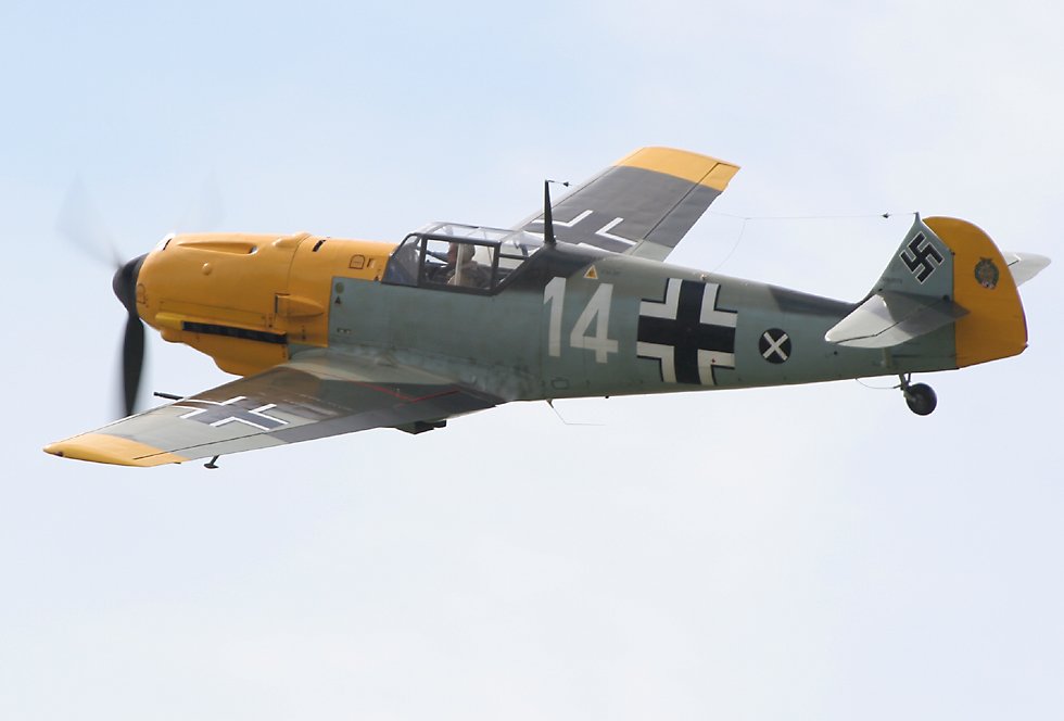 Throwing pearls before... ?
Last edited by mazex; 02/27/11 02:31 AM. Reason: Added another pic...
|
|
|
#3219507 - 02/27/11 02:42 AM
Re: Colors and saturation are way off
[Re: nuggetx]
|
Joined: Apr 2005
Posts: 309
mazex
Member
|
Member
Joined: Apr 2005
Posts: 309
Sweden
|
The WOP one looks like the one in real photo,,, cannot be done??? real planes in 10 years? nay sayers pls go away.
The Oleg moddeler team were probably under influence of SpitGirl or some other 2 week vodka party.....
(and pls don't bring stupid argument that WOP is arcade, PROPER colors and modelling can be done in any game)
Have you have calibrated the colors of your monitor? I just don't understand how you can think that the Band of Brothers sepia nuked WOP shot looks more "real" than the CoD beta? And by the way - if you understand diddley about white balance in photos - please have a look again at the "evidence photo" you presented... A hint, look at stuff you KNOW should be pure white like the text "14" on the side and see if it is clean white...
|
|
|
#3219522 - 02/27/11 03:27 AM
Re: Colors and saturation are way off
[Re: nuggetx]
|
Joined: Feb 2002
Posts: 6,396
VonBarb.
Earth-bound misfit
|
Earth-bound misfit
Hotshot
Joined: Feb 2002
Posts: 6,396
The Dust,Pandora
|
Have you seriously nothing better to do or complain about ?
-Those yellow wingtips are squad specific markings that not all Emils involved in the BoB sported. Hence why they're not there on the DoD planes from the pic.
-The camo pattern is a just a camouflage pattern, by the end of the Summer of 1940 you couldn't have found a pair of 109s that sported the exact same pattern due to panels being replaced and worn out paint being painted over, and there were many different factory and field applied pattern variations. Several of these are represented in DoD as evidenced by other preview screens. Don't like this one ? pick another !
Your complain equals posting just one screenshot to comlain about how RAF fighters seem to all sport a Type A pattern and then argue Oleg's wrong by posting just one other picture of another plane painted in the Type B pattern.
-Who's to say which of the screenshot or the pic is wrong ? Can you prove with absolute certainty that no filters/edits were used on the pic ?
-That shadow/lighting argument : Season ? Time of day ? Light side or Shadow side ? The screenshot and the pic could represent very different settings.
That 'real picture' is a picture of a restored 109, and is not from 1940. LW historians and skinners have been pulling their hair out for years about the proper shades of LW camouflage and markings, especially the field applied camos and recognition marks. And everytime they think they got it right, some new evidence pops up proving them wrong.
Accurate photo evidence from that era is very hard to find. Pics from back then were in black and white, when not sepia, colour photography still being somewhat of an obscure science except for a few rare shots, and there was nothing genuine from that era left to take pictures of by the time they invented digital photography. Some thorough research has to be done when attempting to paint an aircraft as accurately as possible, and the results are often quite surprising : For instance, did you know the Red Baron was more likely the 'Dark Orange' Baron ? Knowing that, would you like your Richtoffen Dreidecker in RoF painted Orange for accuracy, or Red because it feels more 'right' according to your own personnal idea of how it should look ? Was the late war 'Grauviolet' more Grau or was it rather Violet ? Could you describe to me what the RAF SkyS colour used in 1940 looked like ?
So look up the 'LW Yellow' (or any other early war LW colours for that matter) on skinning and scale modelling websites, the actual shades might not be exactly what you had in mind.
The colours displayed in the pics represent the most commonly accepted consensus about LW colours from that era, and they look just fine by me. Besides, as someone pointed out before, this is the result of a modelling job that had to include some part of personnal interpretation at some stage (which is the beauty of it, and makes you prefer some skins over others, some skins artists' style more appealing to you than others...), and they got it just right IMO : everything fits nicely together and looks as accurate as I personally could have hoped from a sim that's been years in the making.
But please note that is just my personnal opinion, that I realise is based on much more interrogations than concrete answers, and Oleg's interpretation of things just happens to be somewhat close to my own. What kind of evidence do you have that is so strong it can back up your claim that the colours are all as wrong as you think they are ?
Perhaps some of the seasonned skinners out there who spent copious time researching the subject for their projects would like to make a comment which would be -no doubt- a lot more educated than mine or nuggetx's ?
In any case, those paintjobs and colours look a lot more convincing and a hell of a lot better researched than any default LW skins in Il-2, and that's a very good surprise indeed for vanilla textures.
Cheers
Nico
Last edited by VonBarb.; 02/27/11 03:28 AM.
"Et s'il ne pleure personne, que Dieu nous le pardonne "
ArmA2/OA - RoF - FSX
ASUS P8P67 Pro Motherboard - Intel i5 2500K @ 3.3Ghz - 8Gb G-Skill DDR3 1866Mhz - Gainward GTX660 Ti Phantom II - Win7 Ultimate 64bits - Saitek av8r
|
|
|
#3219535 - 02/27/11 04:15 AM
Re: Colors and saturation are way off
[Re: nuggetx]
|
Joined: Sep 2001
Posts: 24,712
Dart
Measured in Llamathrusts
|
Measured in Llamathrusts
Lifer

Joined: Sep 2001
Posts: 24,712
Alabaster, AL USA
|
Please no pea soup filter like in WoP. Worst gimmick since lens flare.
And 1940 GB had the same levels of color saturation as 2011 GB. They didn't suddenly invent a richer pallet for Planet Earth in the 1950's.
The opinions of this poster are largely based on facts and portray a possible version of the actual events. More dumb stuff at http://www.darts-page.comFrom Laser: "The forum is the place where combat (real time) flight simulator fans come to play turn based strategy combat."
|
|
|
#3219550 - 02/27/11 05:19 AM
Re: Colors and saturation are way off
[Re: Dart]
|
Joined: Feb 2011
Posts: 446
FozzyBear
Member
|
Member
Joined: Feb 2011
Posts: 446
|
Please no pea soup filter like in WoP. Worst gimmick since lens flare.
And 1940 GB had the same levels of color saturation as 2011 GB. They didn't suddenly invent a richer pallet for Planet Earth in the 1950's. I'm telling you why movie produces, photographers, and game developers - mainly those that produce console games - use filters. It gives you the feeling you are back in time and not flying in 2011 GB fighting the imaginary Luftwaffe. I'm also sure it does more than give you a historical experience, but it might also help with performance and hiding flaws. Have you have calibrated the colors of your monitor? I just don't understand how you can think that the Band of Brothers sepia nuked WOP shot looks more "real" than the CoD beta? No one is arguing that it looks real or realistic. What we are saying, well most of us anyway, is that it looks more believable. The colors set the mood of being back in the 1940s. Why is that? Maybe Band of Brothers and even the Memphis Belle has a lot to do with it. And by the way - if you understand diddley about white balance in photos - please have a look again at the "evidence photo" you presented... A hint, look at stuff you KNOW should be pure white like the text "14" on the side and see if it is clean white... In all honesty, photography has changed a lot since the 1990s. No one really uses W/B anymore, unless you are a wedding photographer. More and more photographers and video gurus are going for that 1970s film look. http://fc04.deviantart.net/fs71/f/2010/195/7/a/Follow_by_kyu_to.jpg
|
|
|
#3219561 - 02/27/11 05:31 AM
Re: Colors and saturation are way off
[Re: mazex]
|
Joined: Sep 2000
Posts: 22,095
citizen guod
Lifer
|
Lifer
Joined: Sep 2000
Posts: 22,095
|
Exactly... Let's compare some other shots of the same real plane with Olegs friggin excellent 109... Yeah, but the GRASS is too green in the photo! LMAO. mazex 1 nuggetx 0
Wisdom is knowing what's enough
|
|
|
#3219562 - 02/27/11 05:34 AM
Re: Colors and saturation are way off
[Re: Dart]
|
Joined: Sep 2000
Posts: 22,095
citizen guod
Lifer
|
Lifer
Joined: Sep 2000
Posts: 22,095
|
Please no pea soup filter like in WoP. Worst gimmick since lens flare.
And 1940 GB had the same levels of color saturation as 2011 GB. They didn't suddenly invent a richer pallet for Planet Earth in the 1950's. Yeah, and Bob Guccione is dead so leave behind the smeared Vaseline on the lens look. 
Wisdom is knowing what's enough
|
|
|
#3219580 - 02/27/11 06:21 AM
Re: Colors and saturation are way off
[Re: FozzyBear]
|
Joined: Apr 2002
Posts: 13,364
Freycinet
Veteran
|
Veteran
Joined: Apr 2002
Posts: 13,364
|
Have you have calibrated the colors of your monitor? I just don't understand how you can think that the Band of Brothers sepia nuked WOP shot looks more "real" than the CoD beta? No one is arguing that it looks real or realistic. What we are saying, well most of us anyway, is that it looks more believable. The colors set the mood of being back in the 1940s. Why is that? Maybe Band of Brothers and even the Memphis Belle has a lot to do with it. But, but, but... - We don't want to play a sim that looks like an old movie, do we? As if colours didn't exist back in 1940. Children the age of 8 and below might think that, when they look at B/W photos, but surely the rest of humanity agrees that a sim should just have lifelike present-day colours, even though it is placed in 1940? BTW, I think they chose that canopy version for reasons of visibility. The other, heavier canopy would be quite easy to look out of in Real Life, because pilots can just move their heads around. In a sim, even for those of us with TIR, it would be an unrealistically annoying impediment to our view of the outside world. Since both canopy types existed and were used in the BoB they went for the one with max. visibility. My guess, anyway.
|
|
|
#3219594 - 02/27/11 06:45 AM
Re: Colors and saturation are way off
[Re: nuggetx]
|
Joined: May 2009
Posts: 8
Flyboy4612
Junior Member
|
Junior Member
Joined: May 2009
Posts: 8
|
I've been watching this forum for years and have been amused by a lot of the complaints that arise. This one takes the cake. I think Oleg's 109 looks terrific. To give everyone some perspective of how far combat sims have come, this is an image of a BF-109 I flew way back during my Combat Flight Simulator 1 days. Look! No hood fasteners and the color saturation is all wrong. Guess what, I enjoyed the heck out of the game!  No game will ever be flawless. We should all just be thankful these games are being made in the first place. If you don't like how it's being made, perhaps your time would be better invested in college courses so you can learn how to produce your own flight simulator instead of whining about what you don't like on forums.
Last edited by Flyboy4612; 02/27/11 06:46 AM.
|
|
|
#3219596 - 02/27/11 06:48 AM
Re: Colors and saturation are way off
[Re: Flyboy4612]
|
Joined: Jul 2009
Posts: 140
monsterZER0
Member
|
Member
Joined: Jul 2009
Posts: 140
|
I've been watching this forum for years and have been amused by a lot of the complaints that arise. This one takes the cake. I think Oleg's 109 looks terrific. To give everyone some perspective of how far combat sims have come, this is an image of a BF-109 I flew way back during my Combat Flight Simulator 1 days. Look! No hood fasteners and the color saturation is all wrong. Guess what, I enjoyed the heck out of the game! No game will ever be flawless. We should all just be thankful these games are being made in the first place. If you don't like how it's being made, perhaps your time would be better invested in college courses so you can learn how to produce your own flight simulator instead of whining about what you don't like on forums. +1 Well said.
|
|
|
|
|
|
|
|
|
|
|
|
|
|
|
Exodus
by RedOneAlpha. 04/18/24 05:46 PM
|
|
|
|
|
|
|
|
