|
#3219115 - 02/26/11 05:17 PM
 Colors and saturation are way off
|
Joined: Sep 2008
Posts: 606
nuggetx

Member
|
Member
Joined: Sep 2008
Posts: 606
|
I cannot believe that color and saturation were made so the planes look like some plasteel toys. Look at the yellow nose, the bloom , color and lightning is WAY OFF. 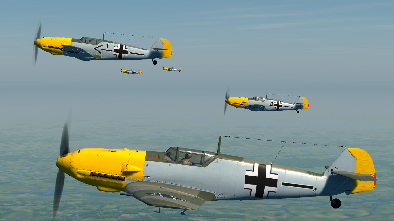 Now compare it with a real picture http://cdn-www.airliners.net/aviation-photos/photos/2/7/5/0903572.jpg(Don't embed copyrighted images - link them instead)Oleg, seriously ?
Last edited by guod; 02/27/11 07:32 PM. Reason: embedding copyright images
|
|
|
#3219119 - 02/26/11 05:23 PM
Re: Colors and saturation are way off
[Re: nuggetx]
|
Joined: Jun 2005
Posts: 2,271
Sluggish Controls
Member
|
Member
Joined: Jun 2005
Posts: 2,271
Hong Kong
|
ain't keeping me awake at night.
Both are lovely shots !
Cheers,
Slug
"Major Burns isn't saying much of anything, Sir. I think he's formulating the answer..." - Radar - M*A*S*H
|
|
|
#3219134 - 02/26/11 05:40 PM
Re: Colors and saturation are way off
[Re: nuggetx]
|
Joined: Jul 2006
Posts: 556
shadylurker
Member
|
Member
Joined: Jul 2006
Posts: 556
|
|
|
|
#3219159 - 02/26/11 06:07 PM
Re: Colors and saturation are way off
[Re: Vekiq]
|
Joined: Sep 2008
Posts: 606
nuggetx
Member
|
Member
Joined: Sep 2008
Posts: 606
|
well, fact is that there is difference between images, but does it bother me?
Lol not at all, i am not going to loose any sleep over it, as long as it flys well Some of us want to have a sim as close to reality as possible, not some xbox imitation.
|
|
|
#3219164 - 02/26/11 06:17 PM
Re: Colors and saturation are way off
[Re: nuggetx]
|
Joined: May 2009
Posts: 14
TonyR
Junior Member
|
Junior Member
Joined: May 2009
Posts: 14
Italy
|
Ok, you are right so, dont buy this xbox imitation sim.
Last edited by TonyR; 02/26/11 06:18 PM.
|
|
|
#3219197 - 02/26/11 07:00 PM
Re: Colors and saturation are way off
[Re: nuggetx]
|
Joined: Jun 2006
Posts: 109
Bounty
Member
|
Member
Joined: Jun 2006
Posts: 109
|
White balance in the "real" pic looks off to me and it lacks contrast. So saying this picture doesn't look like that picture proves nothing what so ever. Unless you produce a PERFECT picture of the real thing taken at the same angle and at the same time of day etc that was in the sim it's all best guess rather than right or wrong.
I'll be more than happy to fly aircraft if they look like that. If it's to much for you then either wait for some new skins or adjust what you don't like via your monitor/Gfx card options
Asus P6T Deluxe, i7 920@4ghz, H50 water cooler, 6Gb ddr3, X-Fi Fatality, 2x GTX580, 2x 120Gb SSD's + 2Tb HD's, 3x 27" 5760x1080,
TrackiR 5 + Pro Clip, Win7 64bit, 2x Thrustmaster MFD's, Combat Pedals, Thrustmaster Warthog #538
|
|
|
#3219246 - 02/26/11 08:13 PM
Re: Colors and saturation are way off
[Re: nuggetx]
|
Joined: Dec 2010
Posts: 290
Slingn
Member
|
Member
Joined: Dec 2010
Posts: 290
|
You all can argue about color tones all you want, and I'm certainly not going to tell you what your own country side looks like. But despite this being a sim, and having realistic goals, it's still someone's personal work. Their own personal creative, and artistic views are going to come into play. It is their work of art as it were, and as such, will always reflect the look, or style of the artists involved.
And when i look, I see IL3, and that's ok by me. More than OK, could you really ask for more than they've given in il2?
Well, I'm sure some will.
|
|
|
#3219298 - 02/26/11 09:29 PM
Re: Colors and saturation are way off
[Re: Damocles]
|
Joined: Sep 2008
Posts: 606
nuggetx
Member
|
Member
Joined: Sep 2008
Posts: 606
|
I'm more puzzled by the type of hood on the 109.
I would have expected the cockpit hood found in the real photo to be the norm, the 109's that I recall seeing in CoD seem to have have a different, lighter framed, more rounded version.
I point it out because one of the failings of the Emil, if memory serves, was its cramped cockpit combined with poor visibility because of the "heavy" framing.
Is the cockpit hood shown above the "Galland" hood ? +1 i'm dissapointed that such little attention has been put into proper modelling of planes. also notice that the green camo in photo goes along the end of the hood to the tail, in the Oleg version it cuts off goes up and then to the end of the tail, it looks ugly, the wingtips are also not yellow.
|
|
|
#3219321 - 02/26/11 09:56 PM
Re: Colors and saturation are way off
[Re: nuggetx]
|
Joined: Apr 2008
Posts: 788
NattyIced
Member
|
Member
Joined: Apr 2008
Posts: 788
|
|
|
|
|


